Applicant Tracking System
OVERVIEW
Role: UX Design
Professional Work
October 2016
I was asked to design an applicant tracking system. The users are HR managers, interviewers, and employees of a company. Since the system is only for internal use, it has to be customized based on their specific hiring process.
UX Principles
EASY OVERVIEW & LIGHTWEIGHT
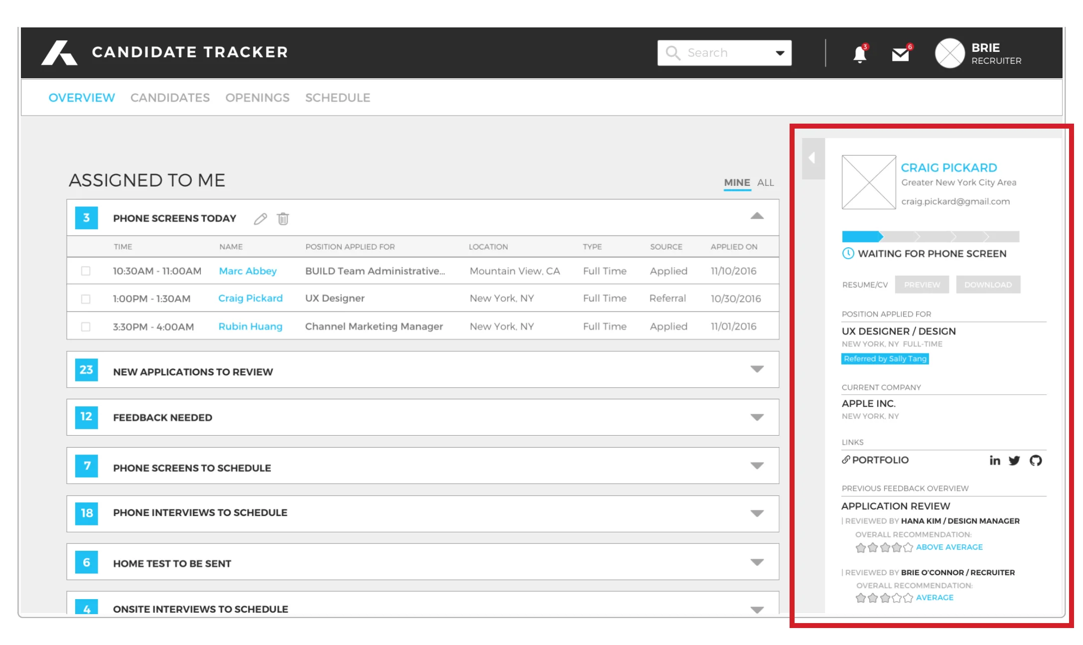
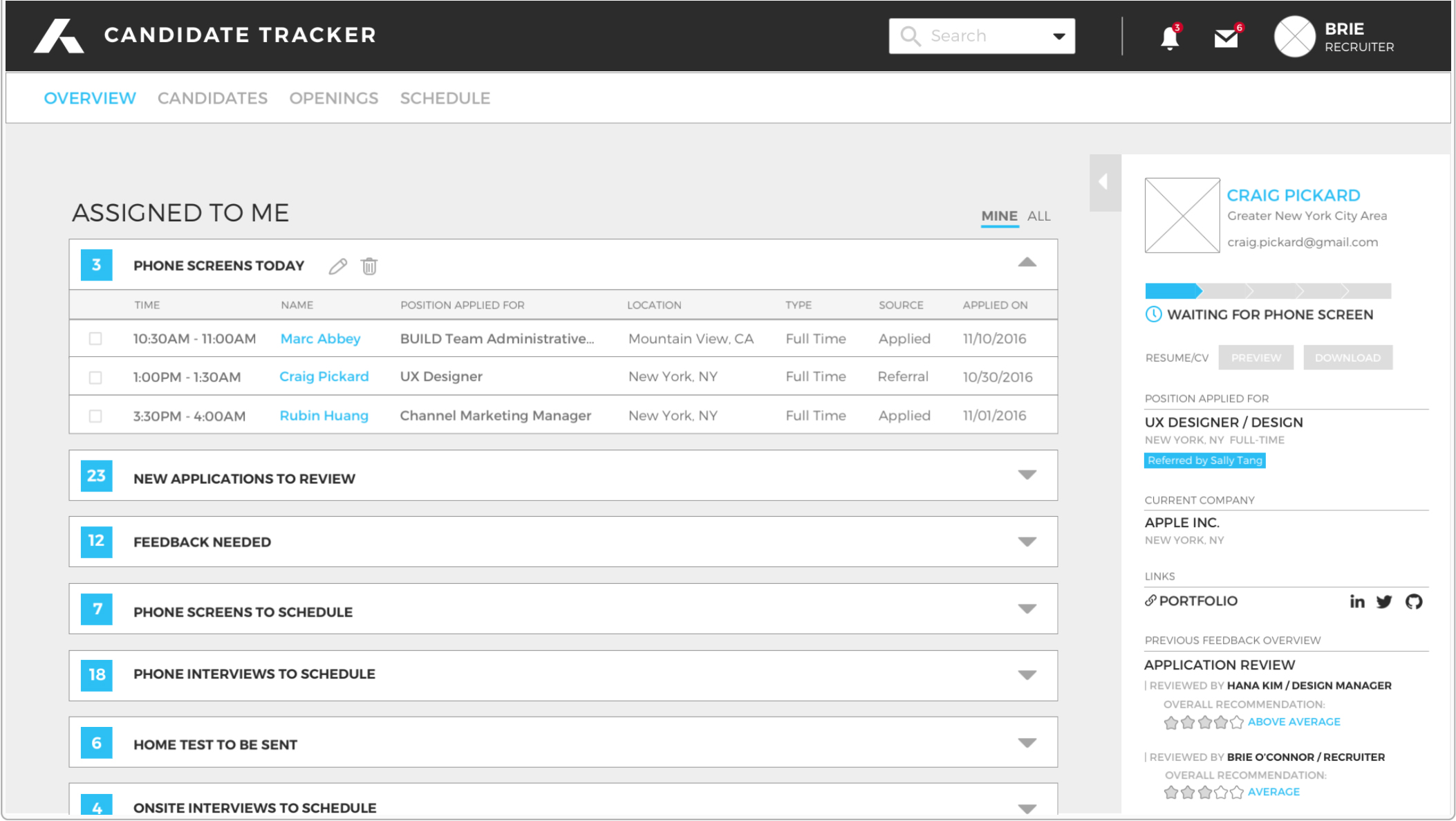
Let users easily skim through candidates info, stage of the interview, and high-level feedback without entering the individual page
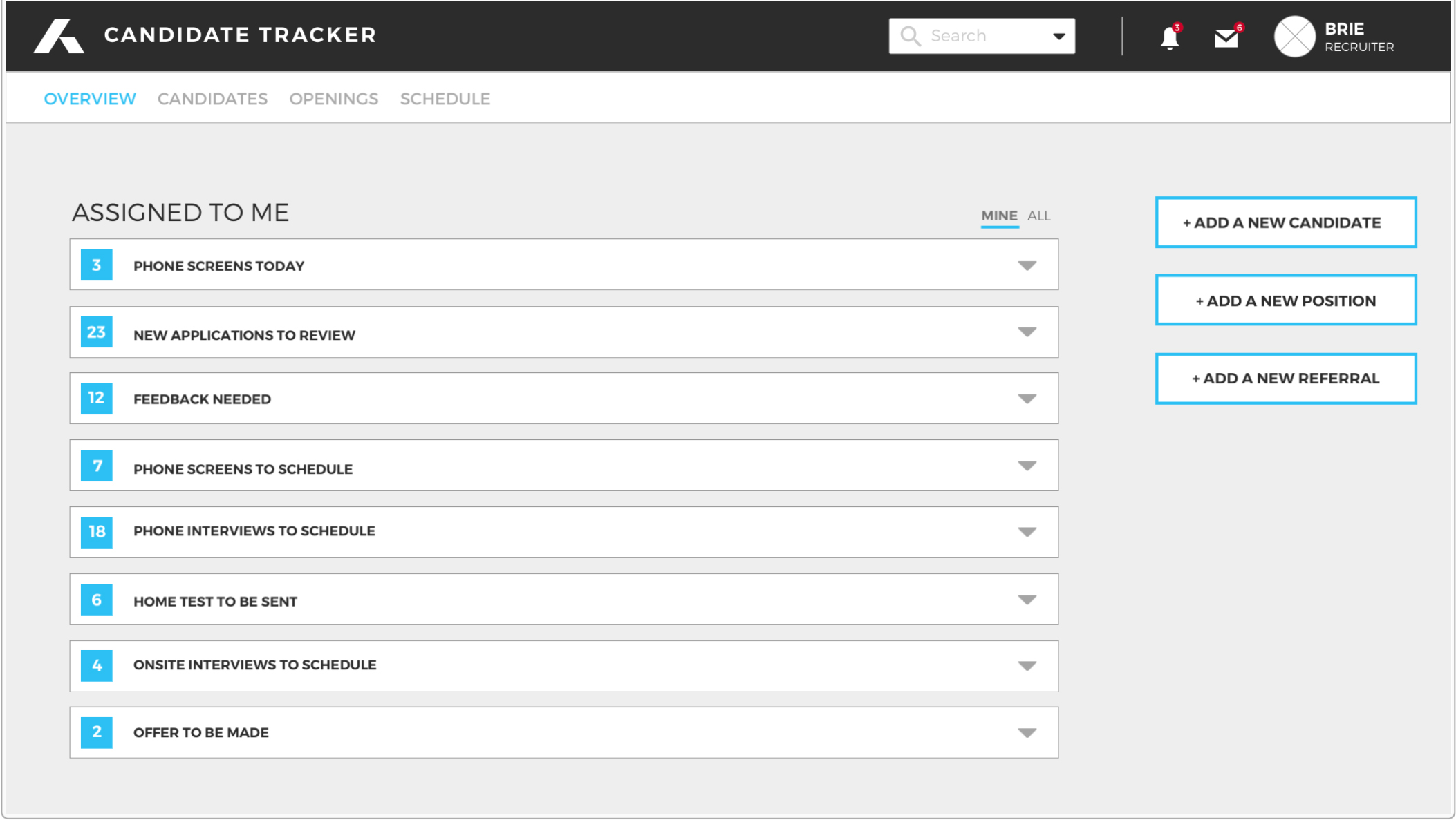
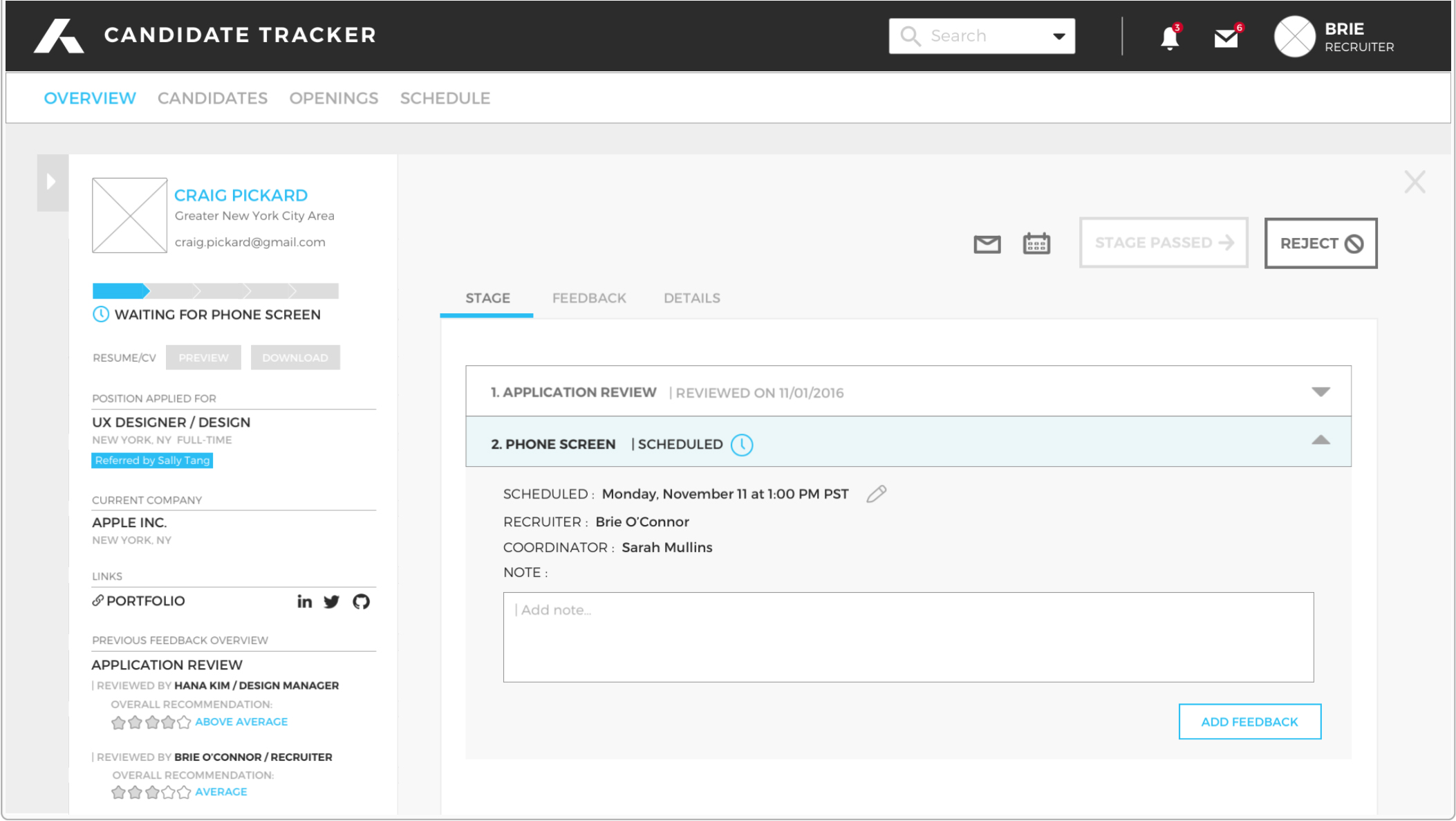
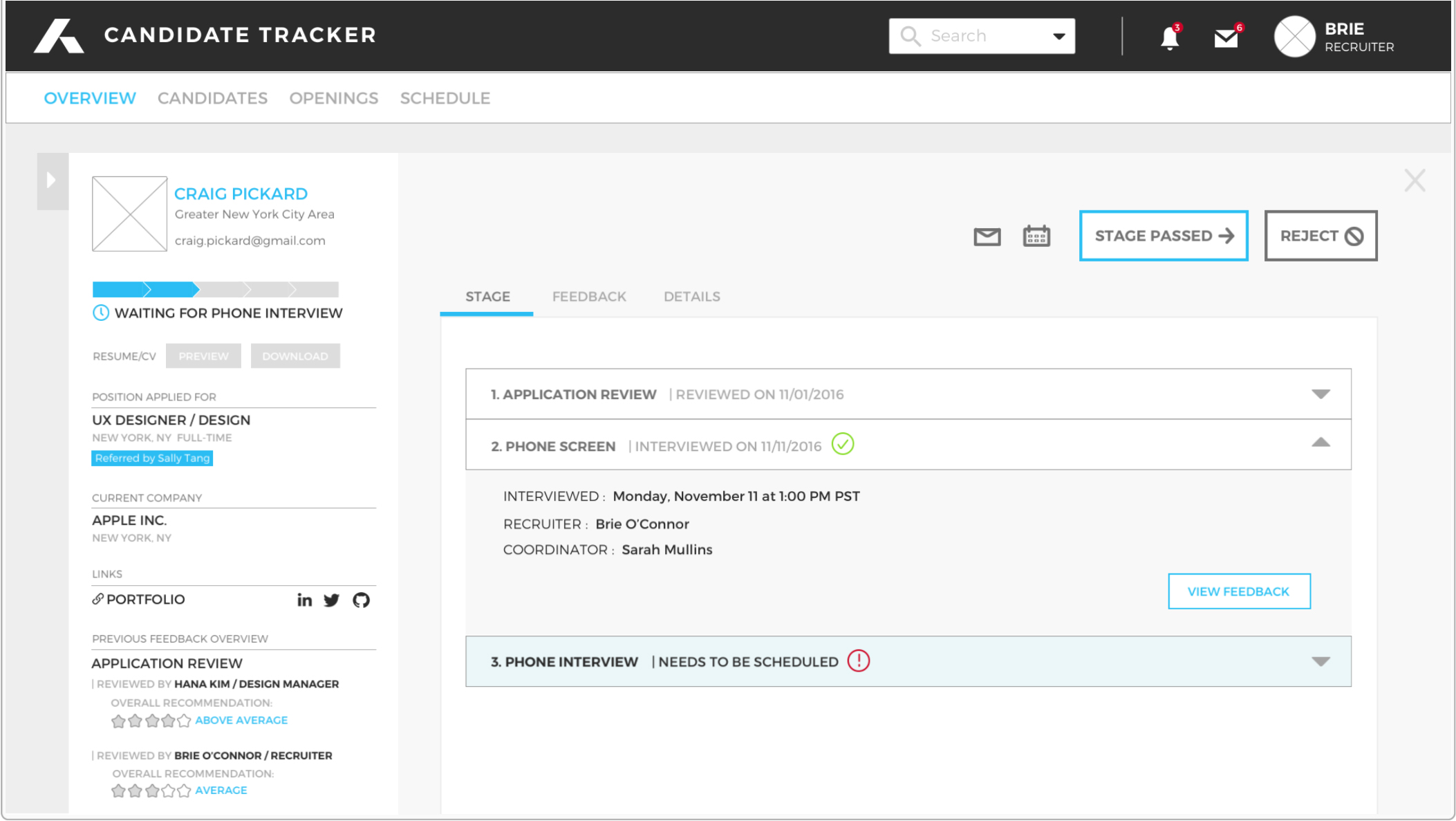
Let users quickly check the action items based on each hiring step (Applications received > Phone screening > Phone interviews > Onsite interviews > Offer)
Let users see only the relevant interface based on their role (HR vs Interviewers) while taking into account programming development efficiency
The Approach
1. Creating personas:
Clarify responsibilities and difficulties per role
2. Use case & workflow diagram per persona
3. Breakdown the action items based on each hiring step
4. User Surveys & Interviews
- Q: What is the most ineffective task that you do manually for tracking candidates?
- Brie(HR): “Manually having to check candidate profiles to make sure they're moving through the pipeline quickly. Our current dashboard doesn't reflect this accurately.”
- Hana(Interviewer): “Most of the candidates that I personally have to manually track are those that I connect with on Angel.co. After connecting and having a conversation, I add them to our system manually.”
- Q: Do you have any features that you would like to add to the current system?
- Brie(HR): "It would be nice to quickly look at profiles and know what the next steps or action items are. This would help to easily and quickly manager the high volume of candidates I need to track."
- Hana(Interviewer): "Some ability to go through the list of applicants so that I can review them quicker to decide if we are going to interview them"
- Q: Which features do you use the most often in the current candidate tracking system?
- Brie(HR): Schedule interviews / Review candidates / Review active pipeline / Add a new candidate / Add a new position
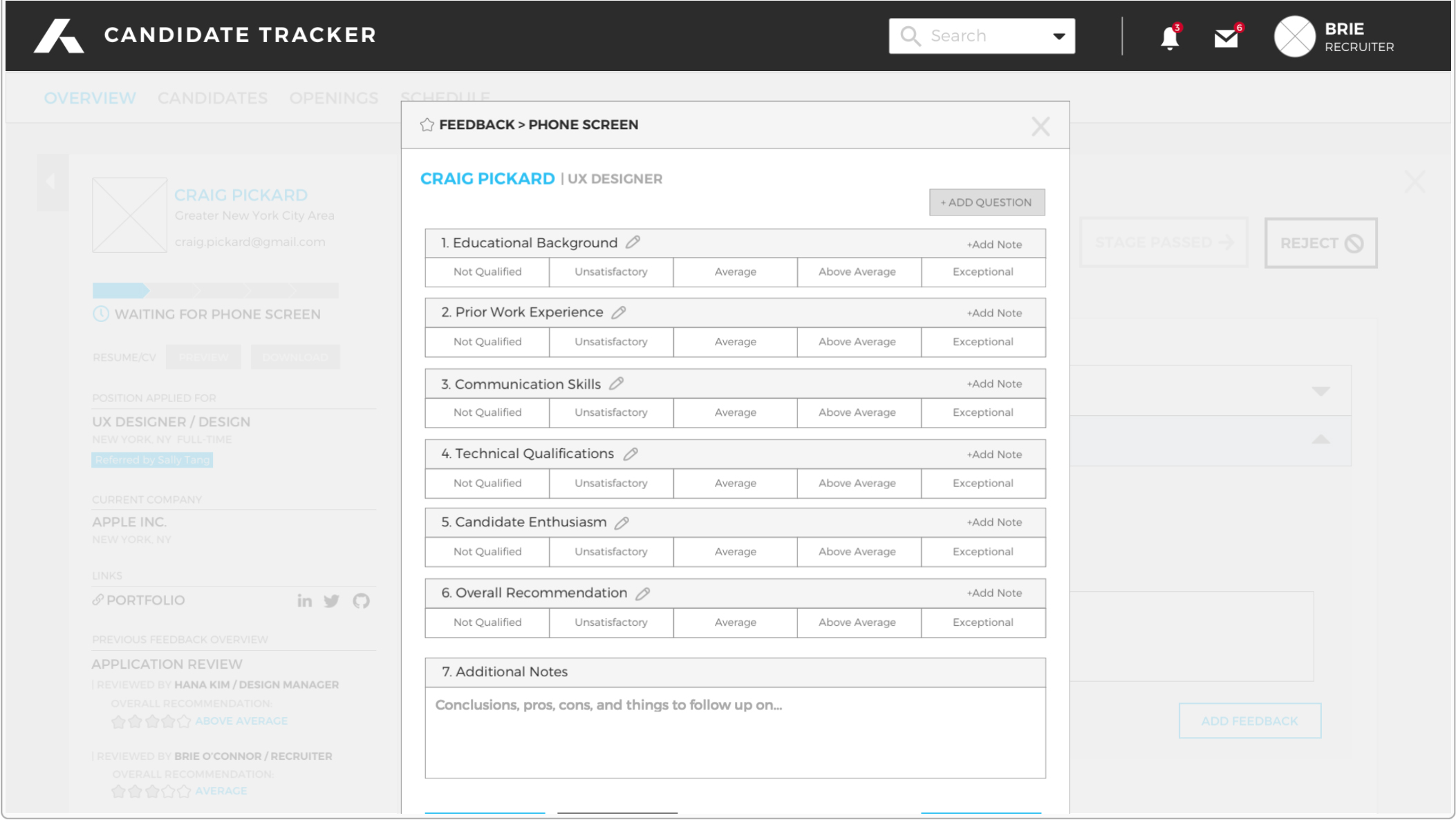
- Hana(Interviewer): Give feedback / Review candidates for interviews.
Process
1. Defining the actions
Overview : Pipeline / Tasks / Schedule preview / Add new candidate / Add new position
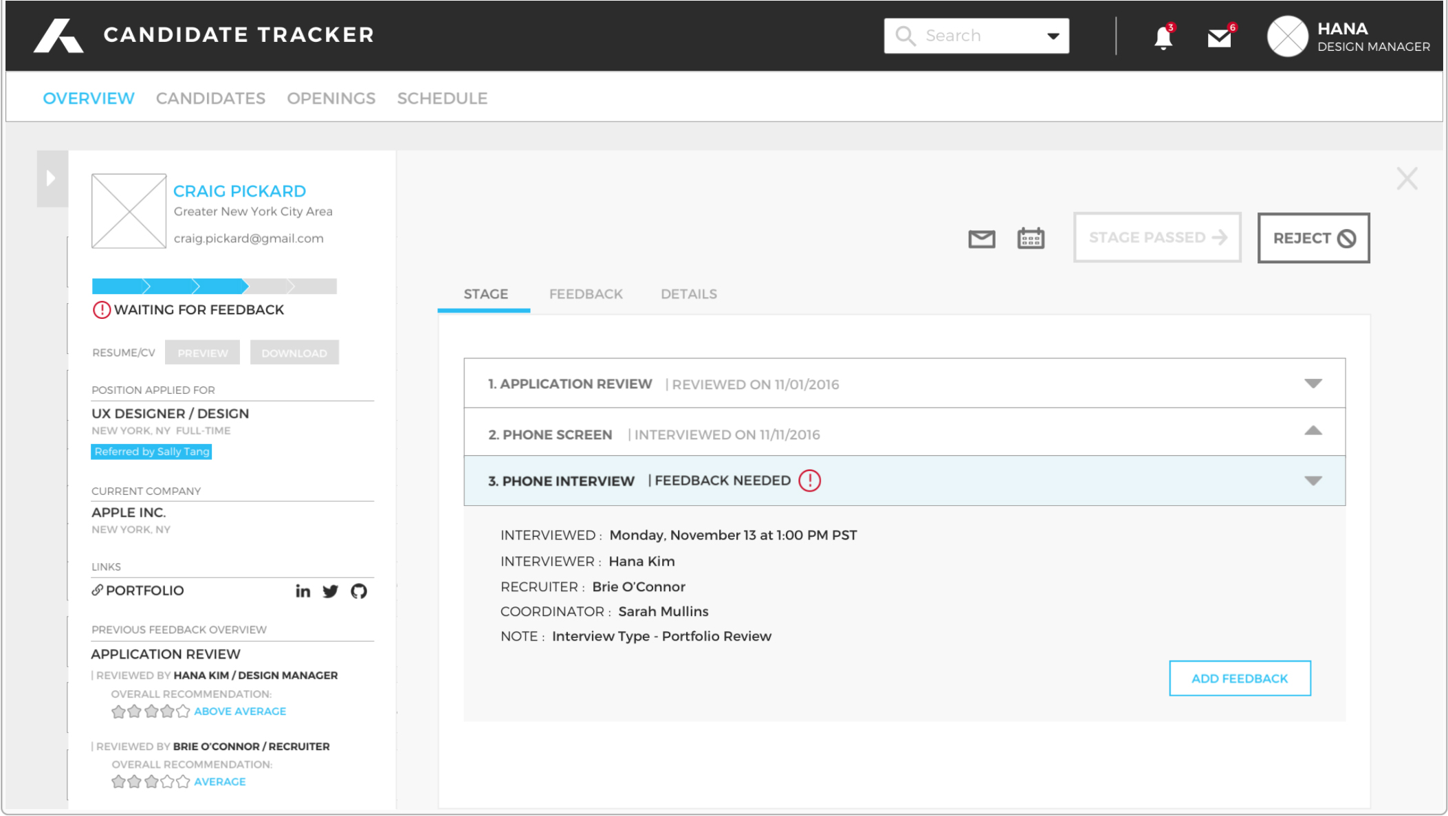
Candidates : Preview / Details / Stage / Feedback
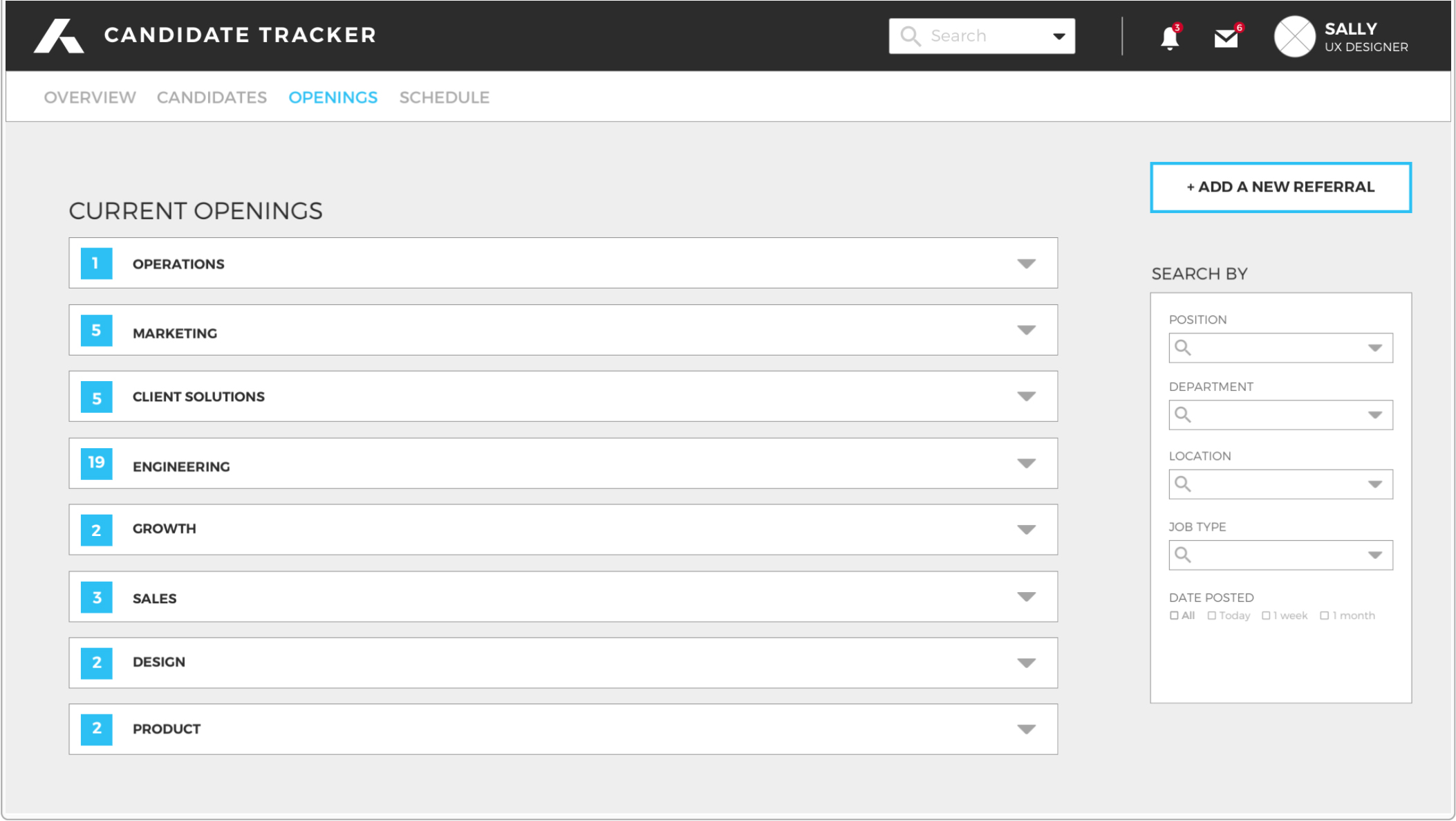
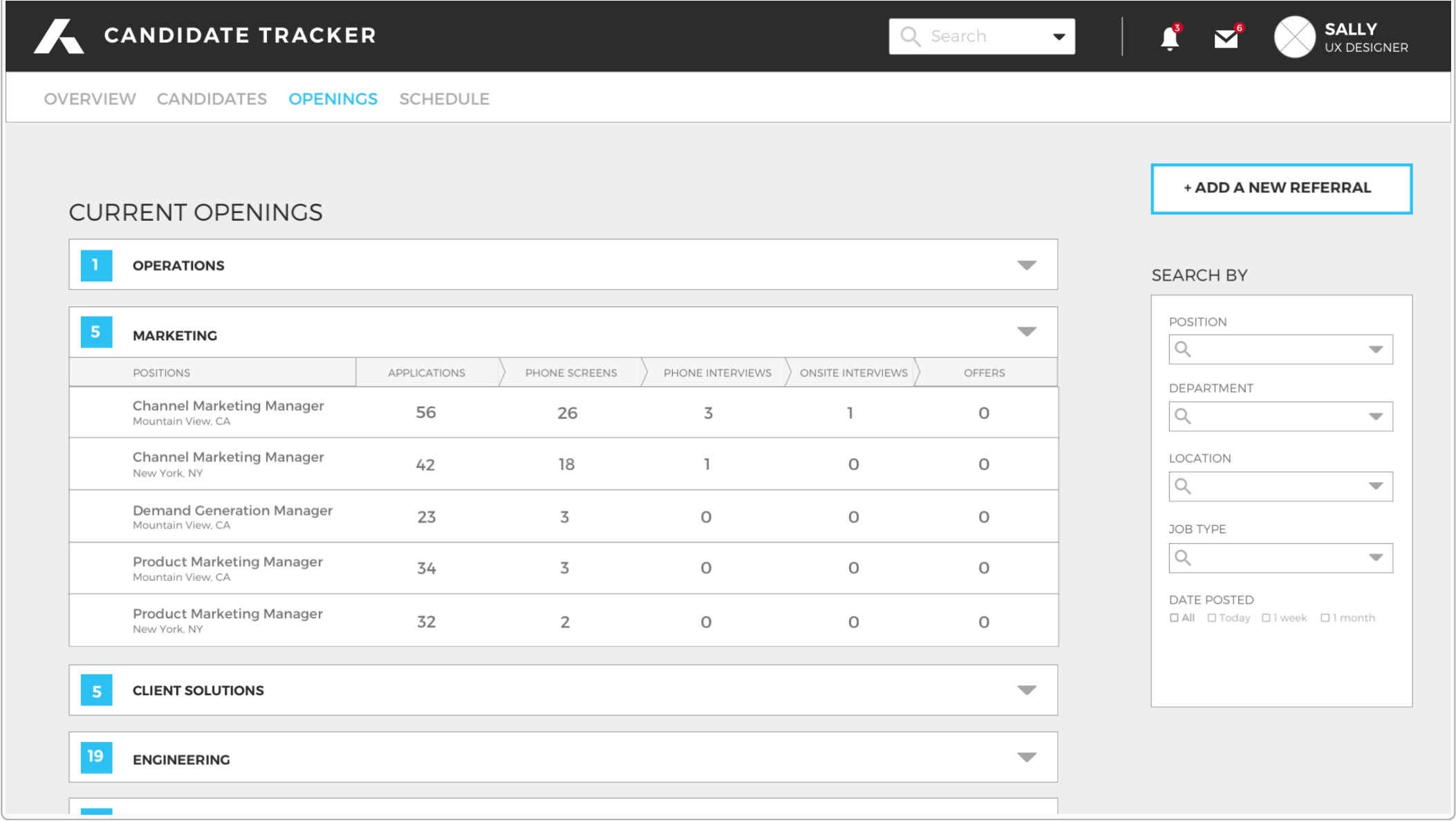
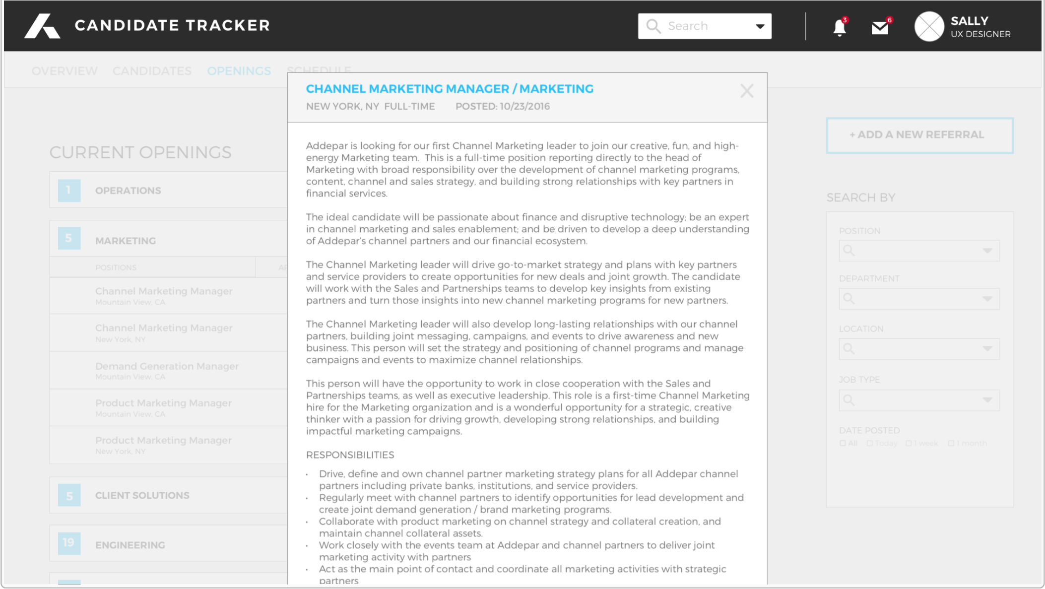
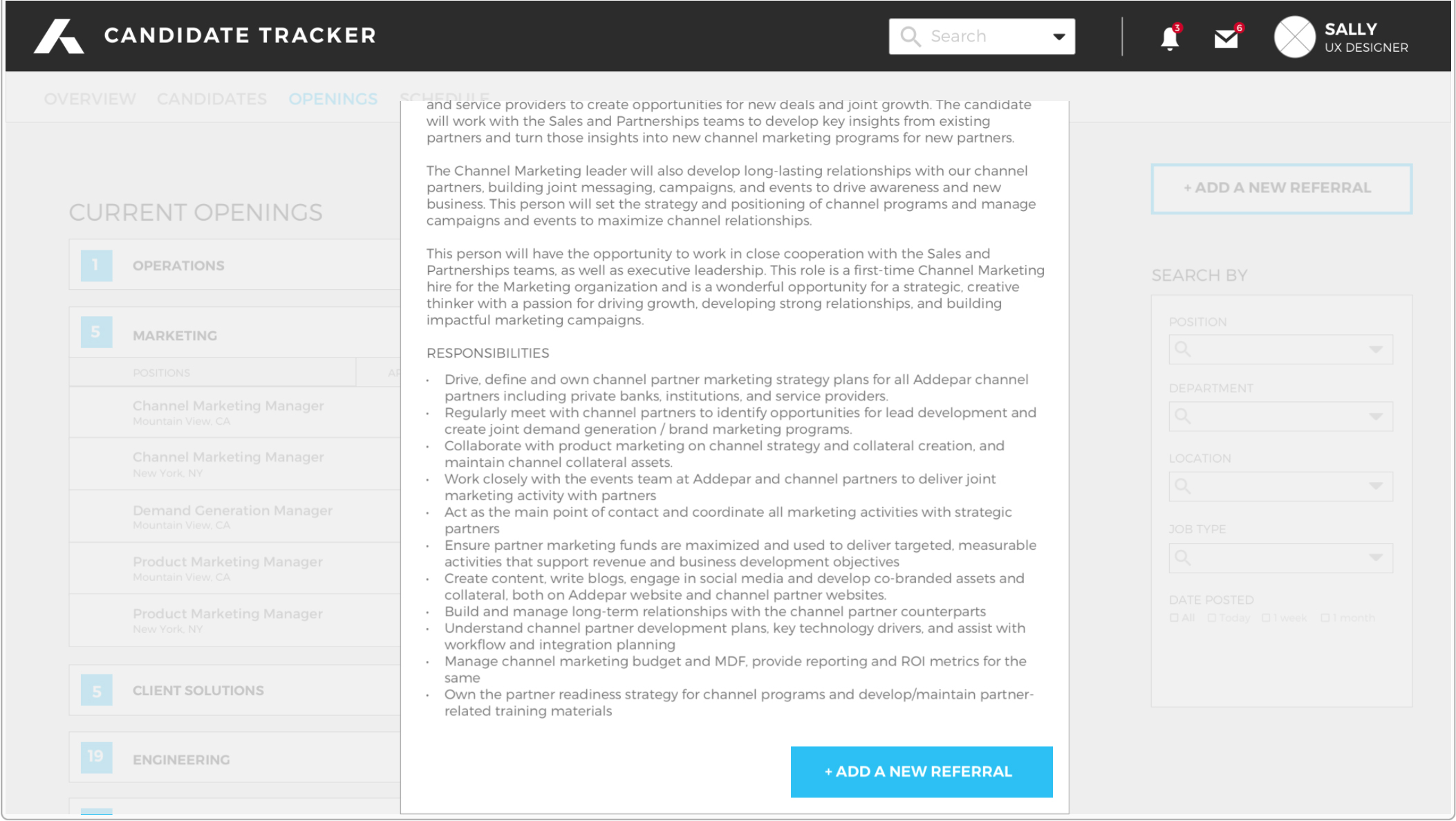
Openings : Current openings / Filter your search results
Schedule : Overview / Scheduling
2. Designs based on different criterion
• Criteria 1: Job openings
• Criteria 2: Candidates
• Criteria 3: Roles (HR manager, Interviewer, Employee)
[Chosen design]
Design & Iterations
Wireframe based on Criteria 3: Roles (HR manager, Interviewer, Employee)
Main page design
• Version 1 (Before the user interview): Dashboard style
- Problem: Discovered that the “Latest Updates” and “Schedule” feeds are not important enough to be featured in the main page.
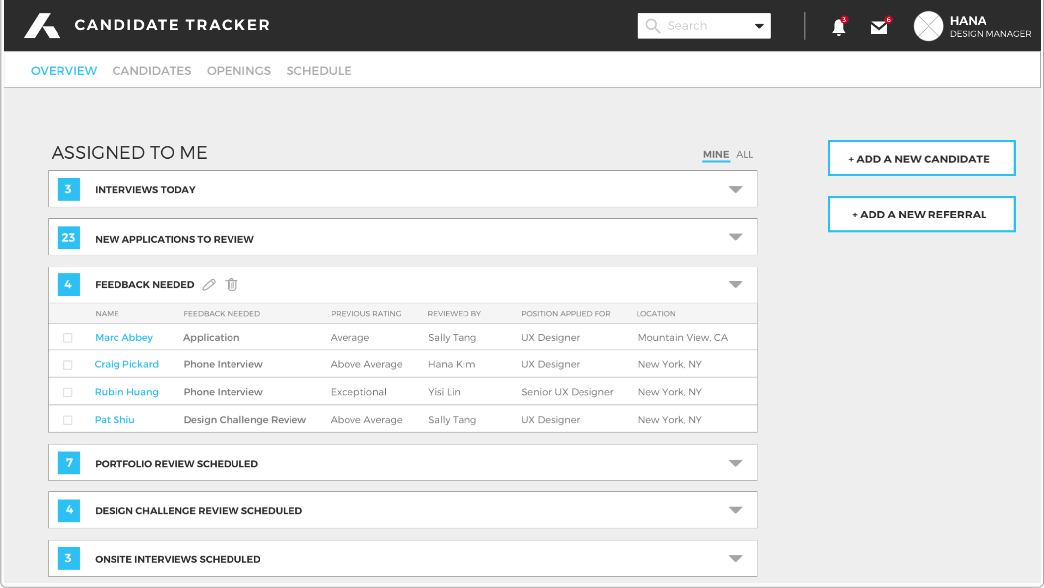
• Version 2 (After the user interview): Populating lists of candidates based on the action items
- Problem: Difficult to see all action items at once & Too much immediate information
Results & Key Features
1. Using the hiring process/action items as the menu
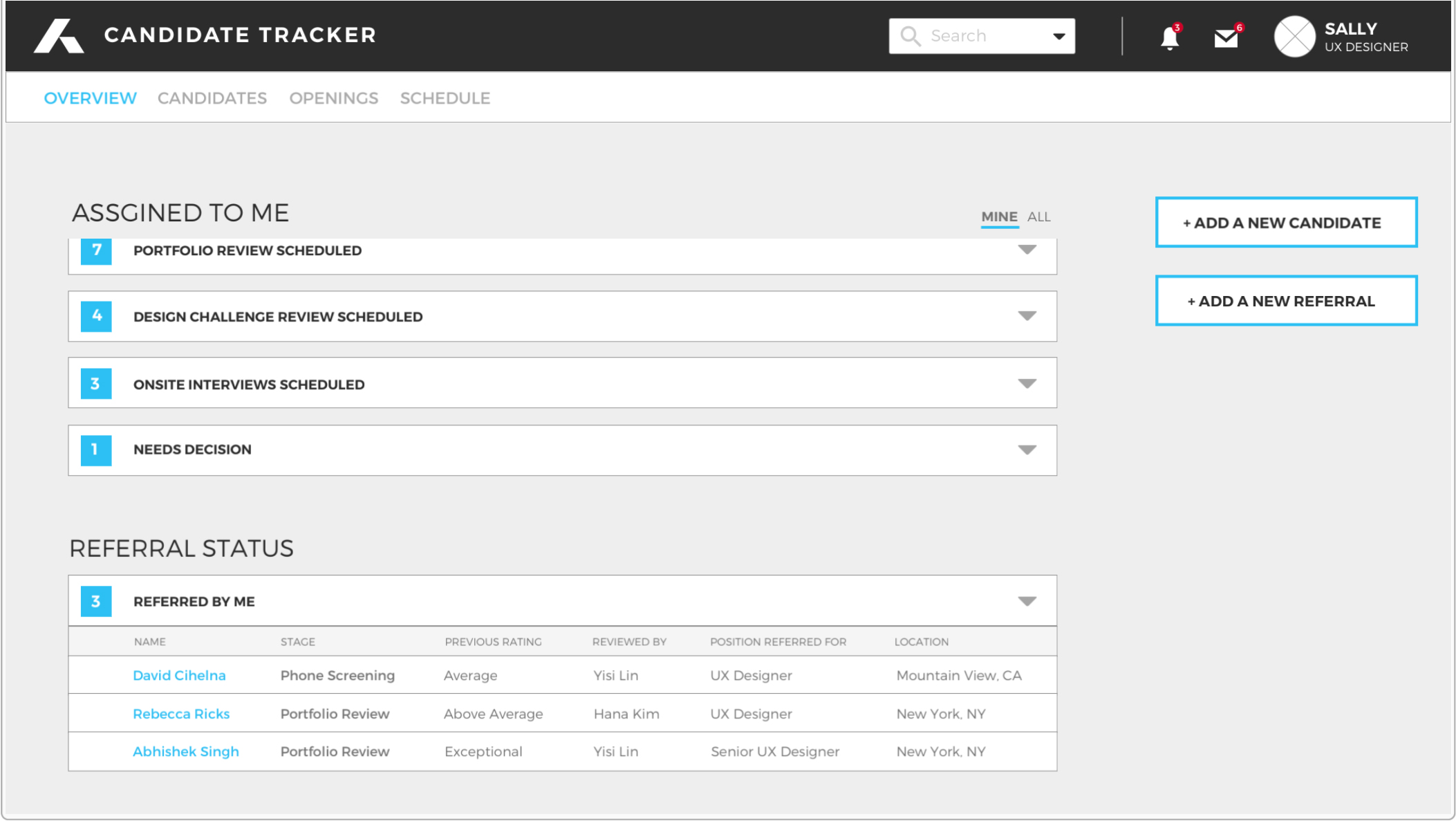
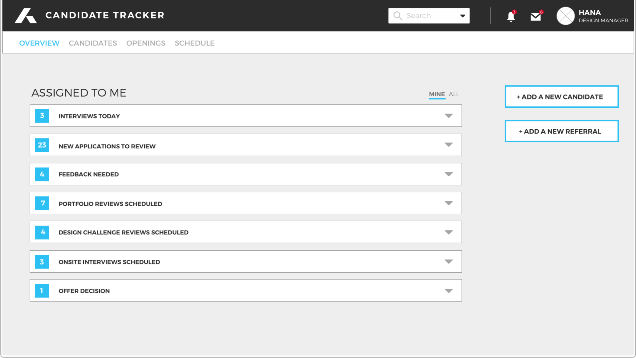
2. Easy to glance at assigned task counts
3. Displaying different hiring process/action items based on users’ role
HR Manager's Overview
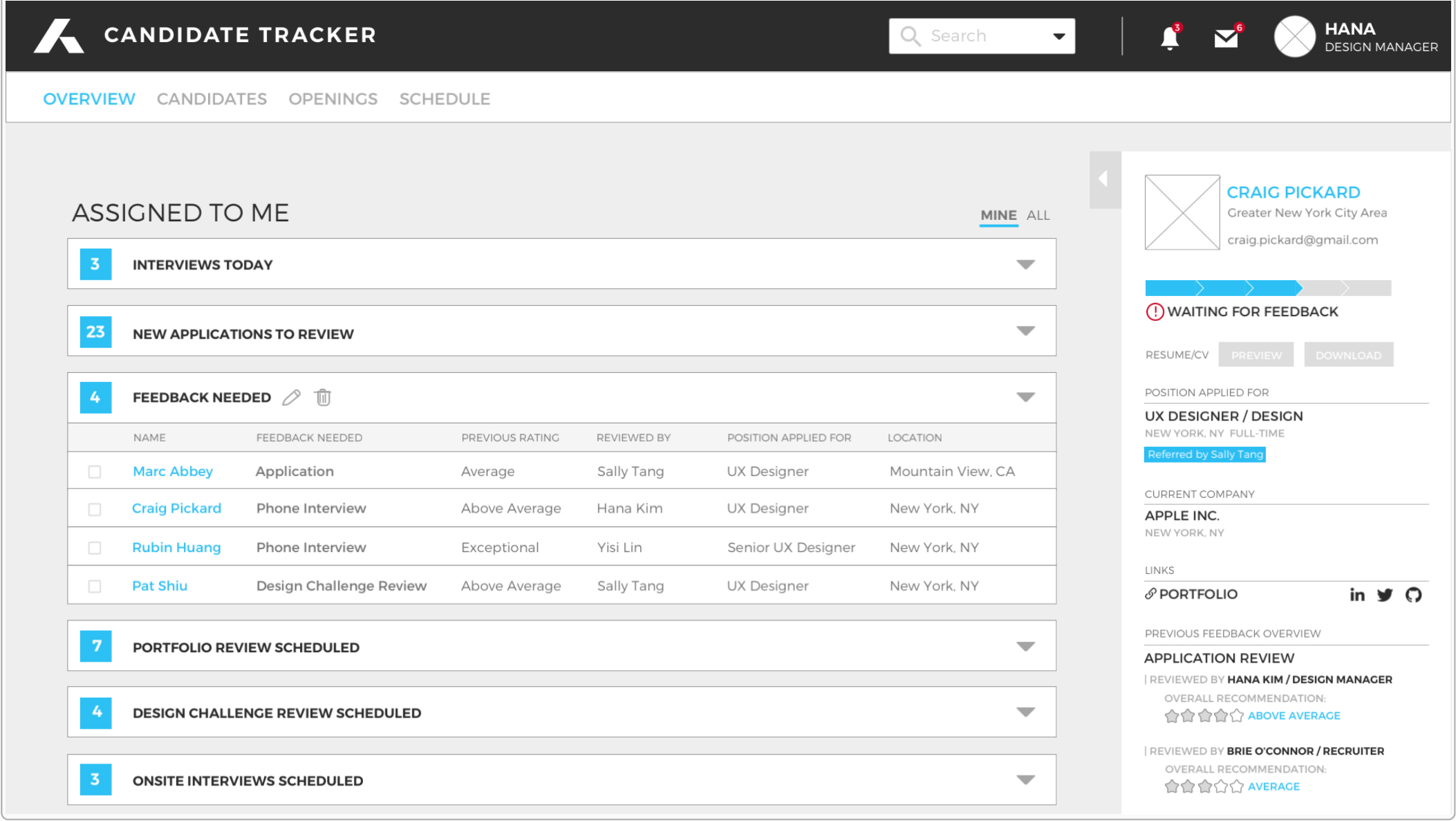
Interviewer's Overview
4. Candidate preview section for users to skim through multiple candidates without getting into each profile page
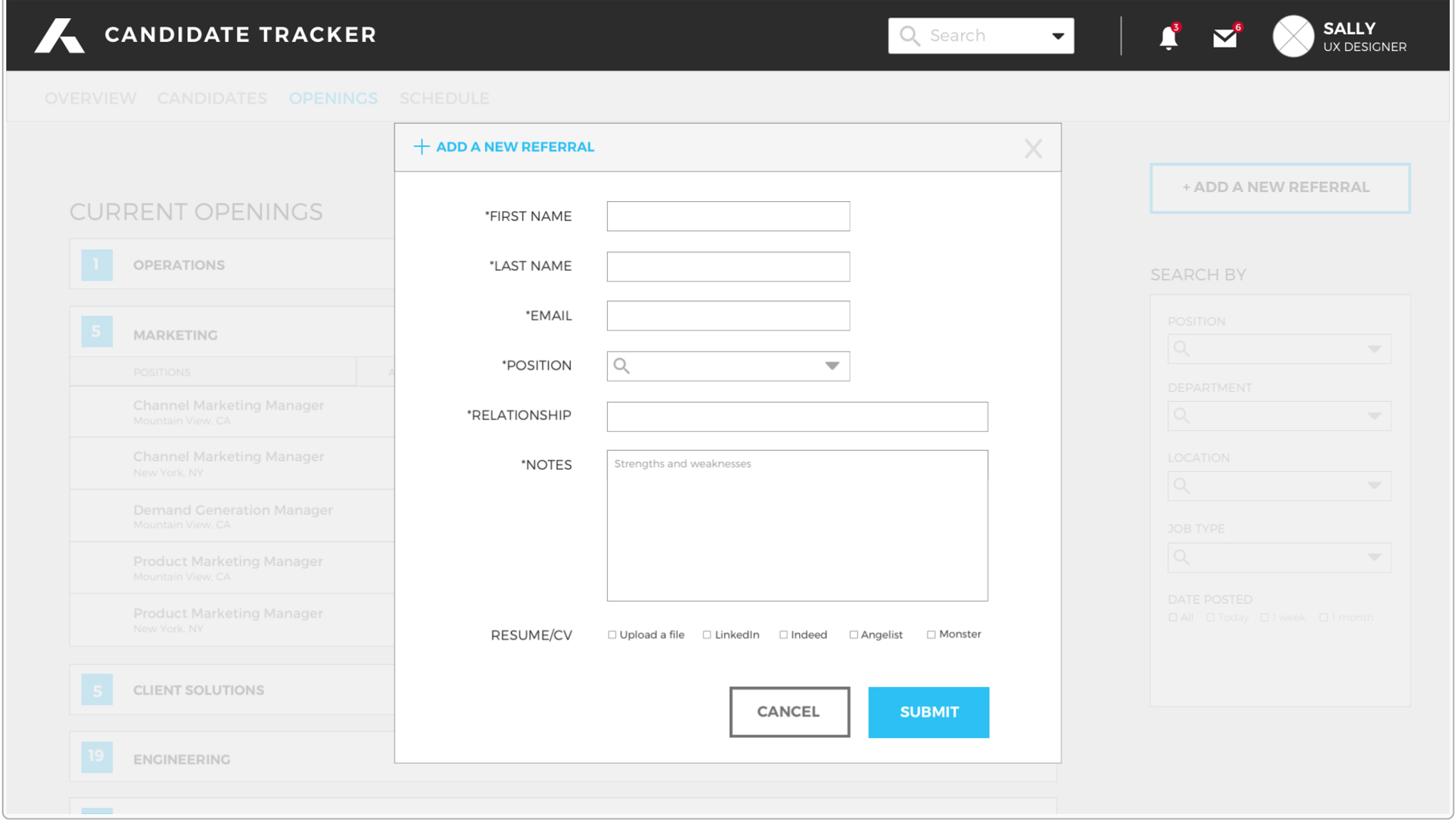
5. Sync candidate’s information with external job boards to add new candidate seamlessly (LinkedIn, Indeed, Angelist, Monster, etc)
screenshots
1. For HR Managers
2. For Interviewers
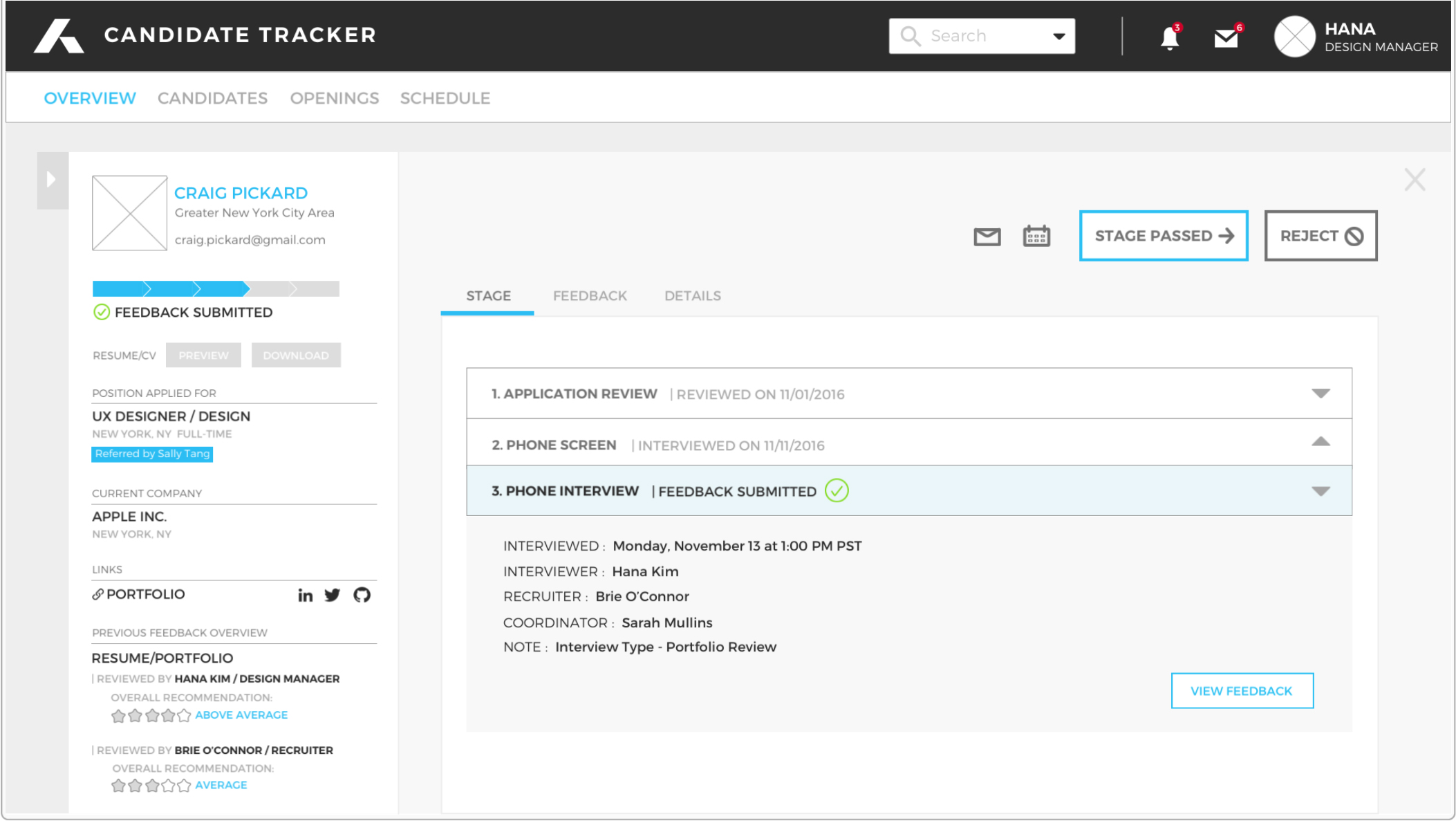
3. For Employees
