
Reimagining NYU Albert Interface
UX/UI Design | 2015
1. Showcase
NYU Albert the gateway to access in NYU’s student information system. It can be used by applicants, faculty, staff, and most importantly, students who have an authorized NYU account.
In terms of user experience, I thought NYU Albert is the one that I could come up with a reimagined version of it and that is in need of improvement.
2. Problem
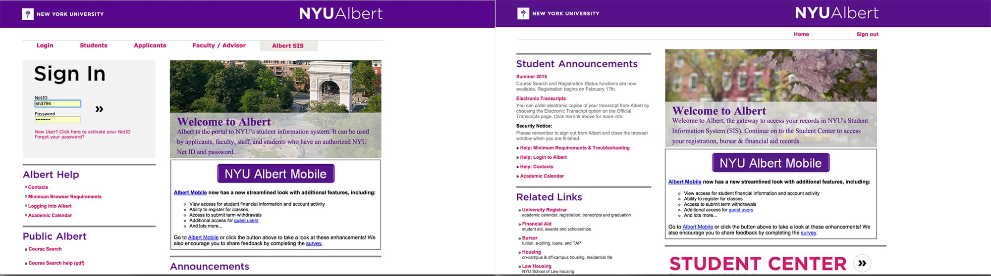
Homepage (Log in page) Landing page (after logging in)
(The existing Albert pages)
Too much information in homepage
- Even though users can access to most of the sections after login, it shows too much information in login page. It needs only login form, help section, and information for applicants in login page.
- The tabs on the top which is categorized as group of users, can be removed since most content in each tab is duplicated and overlapped.
No hierarchy of content
- Homepage : Login box should be pointed up among all the information.
- Landing page : The menu named 'Student Center' is the most important reason for students to visit Albert. However, it’s hard to see as a button and user needs to scroll down since it is placed at the bottom of the page where is clearly not recognizable.
Unnoticeable promotion design
- Even though there is a box that says ‘NYU Albert Mobile’ in both homepage and landing page, it is hard to draw users’ attention since the information is quite unnoticeable.
3. Troubleshooting

(Information Architecture Ideation)
Homepage design
- It needs to be removed all the content that required login and leave the information that is not required login.
Landing page design
- All categories should be rearranged in order of importance. By placing 'Student Center' menu on the top and grouping each section more clearly, make interface more straightforward in a screen without scrolling.
Redesign the promotion for Albert mobile by using graphic elements

(Information Architecture)
4. Wireframe
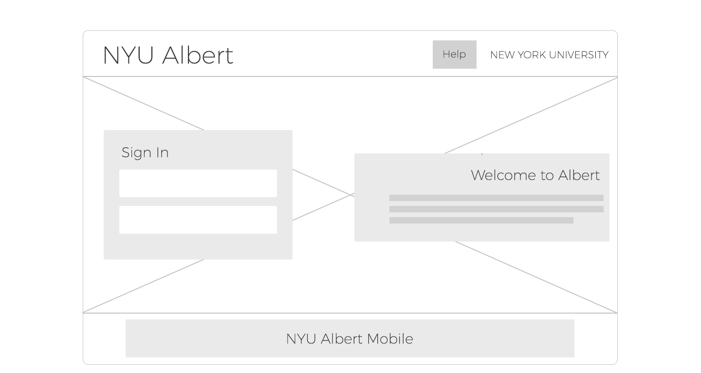
(Homepage wireframe)

(Landing page wireframe)
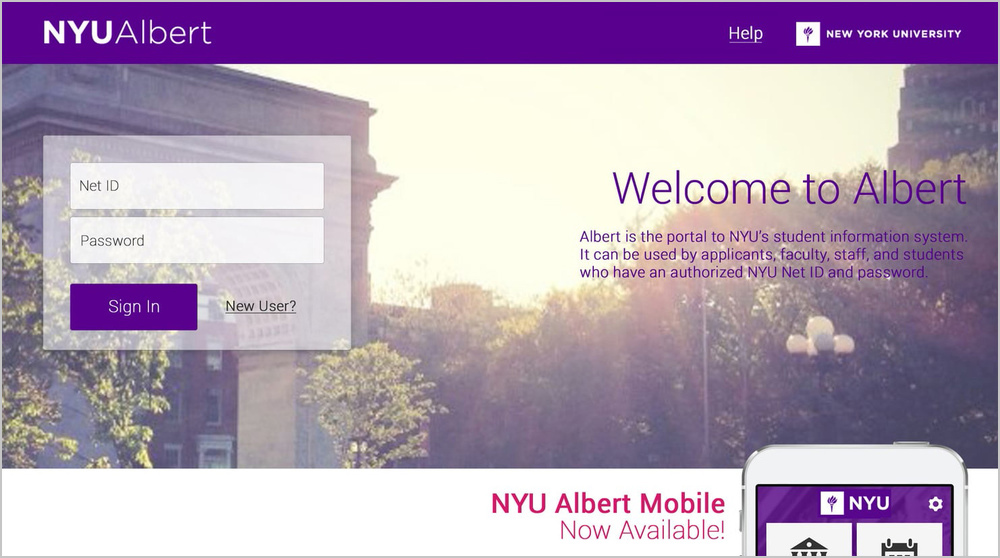
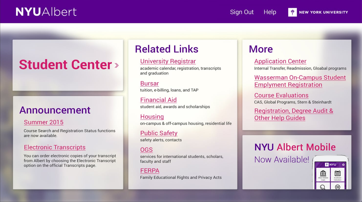
5. Final Result

(Homepage interface redesign)

(Landing page interface redesign)

