Observation : Muni-Meter in NY
Right in front of my apartment, there is a Muni-Meter which is a parking meter system that I've never paid attention to before. However, I saw a man staring at it at least 3 minutes without any movement just like the picture above. So I decided to observe the kiosk and tried to find out how people use that system.
How the Muni-Meter works
The interface of muni-meter seemed like quite simple and easy. And payment instructions are well informed as well. After parking, purchase as amount of time you want, print receipt and return to your car and display the receipt on your dashboard.
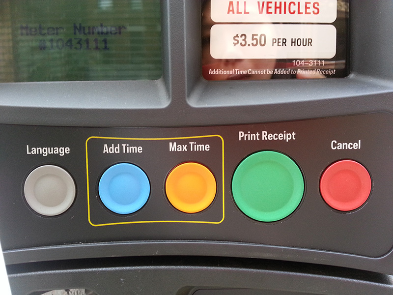
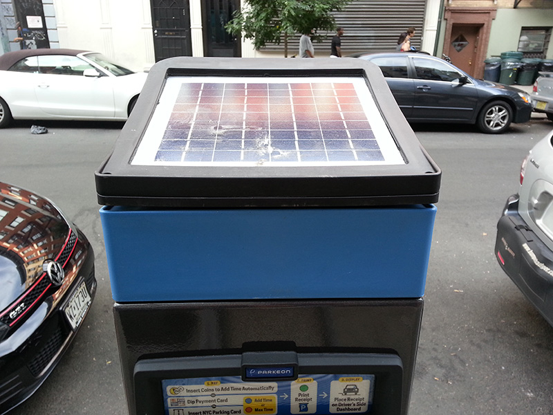
there are six buttons which the colors are all different. An audio button which is for English-language audio instructions, language button supports transactions in six different languages and add time or max time payment buttons which make completing transaction in only two clicks. Also, the biggest button is for printing receipt that is most important process because without the receipt, it is regarded as illegal parking. In addition, on top of it is an angled solar panel so that it can be charged very eco-friendly. In terms of the shape of this facility, it avoids unnecessary sidewalk encumbrances.
Difficulties
It seems like it takes less than 2minutes for people who usually use this system. People who use it for the first time, however, it may take a little bit longer to try to figure out the specific parking regulations, and etc.
People should always check the legal parking duration signs carefully before parking since the duration vary from 1hour to 12 hours. However, there is quite unnoticeable guide inside of the rate information that just informed, "See posted sign for parking limits, day and hours of operations" and the sign is separated from the kiosk. I think it would be more convenient and intuitive if a Muni-meter includes the information than posted in the green meter signs on the pole.
Moreover, even though the Max time button exists for quick payment, there is any signs to find out how long the max time is and I think it should be in the instructions.
Another thing is that, I assumed that the size of print receipt button is designed bigger than the rest of buttons to inform people the importance of receipt. However, I think it would be more effective that design 'Print receipt' text itself more larger or emphasize it in some way rather than making the button bigger.
I searched that a Muni-Meter what I saw was recently renovated and improved one replaced throughout New York City and I think the interface is being successful. However, It would be much better to use for all users regardless of their levels of experience by getting rid of a couple of difficulties stated above.


