


Data Visualization of New York Times' Popular Articles
Data Visualization
As I mentioned earlier, I've tried to do data visualization which is related to analyzing content consumption. I kept using New York Times API, the one that I chose for my data assignment for the first time. While I was doing my final project, I've struggled with how to make it beautiful and convey the information clearly at the same time.
Phase 1. Several attempts to make 'data visualization'
- Visualizing most shared articles top 20 listing by titles

>> Even though the user interface is easy to check out the popular articles, it is more like website, it needs to be more visualized.
-Visualizing images from most popular articles
I looked more carefully at the NYTimes api and realized that it is possible to pull up images from the articles and I decided to use images for data visualization. It took at least for 2 days to only figure it out how to pull up images from articles. I had a great chance to learn about several functions I've never used before such as try/catch statement during this time.
At first, I decided to display top 20 articles' image as thumbnails and if users click the area, it goes to the next window that arranges images in order of the ranking.

While I've been trying several thing, I wondered what it could be if I display images as individual character from each title. I applied the String chapter example from Learning Processing. However, it didn't work as what I expected. I couldn't figure out the reason but it didn't represent the images as it is.

On top of this, since I was not sure about the concept and exact meaning of doing what I planned, I kept thinking other ways to visualize data.

Phase 2. What should I do with this images??!
- Analyzing popular sections by comparing between most viewed and most shared articles
I was still stuck with using images and I couldn't give up using it. I decided to start from scratch and identify a concept .
1. What I'm interested in : User content consumption / Content curation
2. What I chose : Using NY Times most popular API which includes most emailed/shared/viewed
3. What the api provides : Ranking, Articles, Images, Section info about each article and etc.
4. What I had done : Pulling up the titles and images from popular articles
4. What I can represent : I came up with the idea that it could be very helpful to curate content if I know what categories are popular to users. Even though the New York Times' readers have exceptional character, I decided to analyze it starting from New York Times and extend it globally.
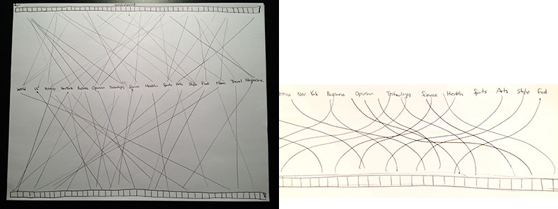
>> Overall image

>> Interface details

I decided not to draw Bezier curve. Compared to the straight lines, it seems quite distracting than I thought.
