AIRPLANE SEATBACK INTERFACE WIREFRAME
UX/UI Design | 2015
1. SHOWCASE


In UX design class, we were asked to create wireframes for 4 screens from an in-flight food ordering app.
A PASSENGER SHOULD BE ABLE TO ORDER :
- Soda (4 types), juice (2 types), coffee, tea water–and ice/no ice, can/no can, coffee with or without milk (whole or skim) and sugar/no sugar
- Sandwich (3 types) with or without mayo/mustard
- Salad (2 types) with dressing (4 types),
- Snacks (4 types of chips) or nuts or fruit
- Dessert: cookies, yogurt (3 flavors)
AND MORE :
- Identify Quantity
- Place their order: 3 payment options or cash
- Cancel their order
- Change order
- Or signal to not be bothered
2. information architecture ideation
First of all, learning and trying 'Proto.io' was amazing experience. I'm still a little clumsy using it, but it was really enjoyable so that I've kept messing around with the tool and trying various cases very easily in a relatively short time.
1. Home Screen
At first, I tried to make simple, intuitive interface. I made 4 big buttons on the right side of main screen so that people can easily choose what they want. And I thought it would look much cooler if there is a nice, welcoming background image on the left side in design wise.
2. Landing Page (Beverages) - Menu selection
I was struggling with placing sub-options such as ice, milk options. I decided to place it as drop down list in each menu so that users can choose based on their preference after choosing a menu. I'm still doubtful about my decision. I'd like to think about the better way to place it.
Once you choose a menu, it shows at the bottom of the screen. You can cancel your current order or add to cart to place another order, or just checkout right away.
3. List Menu - Add order
This part was what I struggled with until the last minute. It was really hard to add one more button which leads user to other menu to add more order. After all, I decided to place a list button on the upper right corner and once user click the button, other 3 options of menu except the one that you already choose will come out as same interface as in home screen. I'm not that sure about my decision cause it is definitely not intuitive as what I expected. Maybe I should replace the plus icon instead of list icon or move the button to next to the 'add to cart' button. I'm still struggling..
4. Landing Page (Foods) - Menu selection
5. My cart
6. Add more item
I placed the 'Add item' button on the cart page, so that people can add more food when they change their mine right before they checkout. The 'Add page' is exactly same as the home page except the message on the left side. If a user wants to go back to their cart, they can simply click the 'Back to Cart' text on the top left.
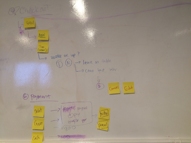
7. Checkout
Before paying for it, users can choose whether they want to eat right away or to make reservation for later. Finally, make a payment and it's done!


