TAPZIN
Korea's leading digital magazine & content distribution platform
OVerview
Role: Product Lead
Company: Next Paper Media
Team: 2 Designers, 2 Editors, 4 Developers, 1 Marketer
June 2011 - August 2014
Tapzin is Korea's largest multi-platform distribution service for magazines. Started as the first employee with two founders (1 BD & 1 Tech), I oversaw product - from solidifying concepts & defining specs to product launch in app stores. As a product lead, I communicated directly with publishers and advertising clients while managing the internal teams.
Over a period of three years, Tapzin grew into 1 million+ active users with 200+ magazines.
Growing Tapzin, growing myself
At first, I started with designing the interface for the app and transforming printed magazine into digital format. This task required me to be in charge of both production and communication with the publishers directly, and it formed a foundation of my knowledge of dealing with native apps, digital content, user experience design, and communication with clients. As our service gained traction, my roles were broadened to manage the iterative process of product development: analyze user behavior, aggregate feedback from both users and publishers, develop strategy, deliver to internal team, improve the product, and release again.
version 1.0:
the Advent of Tablet, and defining digital publishing
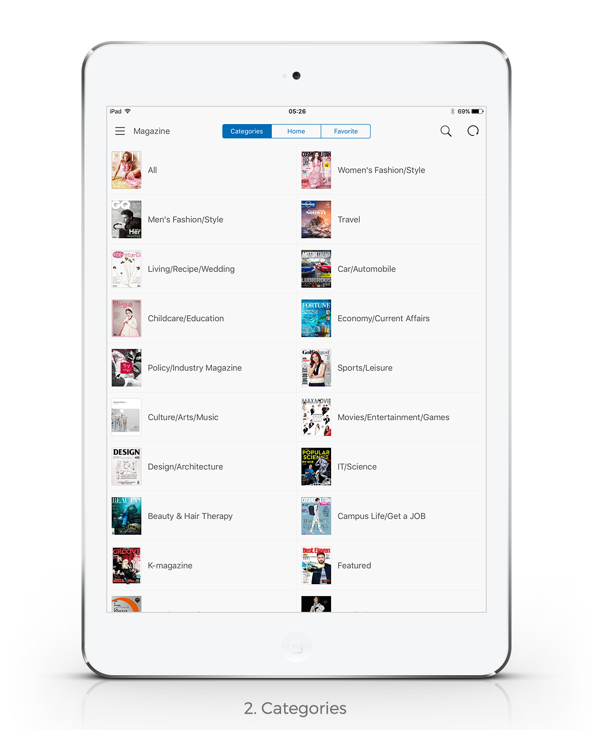
When I joined Tapzin, the concept of “digital magazine distribution” was just beginning. The founders of the company had created a PDF distribution system, and secured the rights to a few magazines. I started by looking at the systems we are used to on the web, and adapted them to magazine content platform.
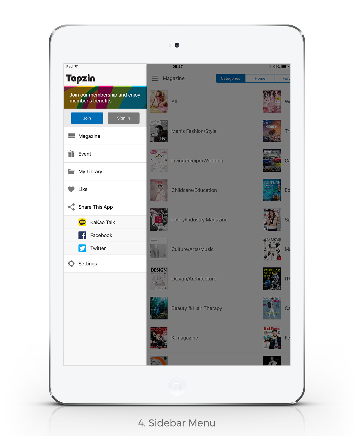
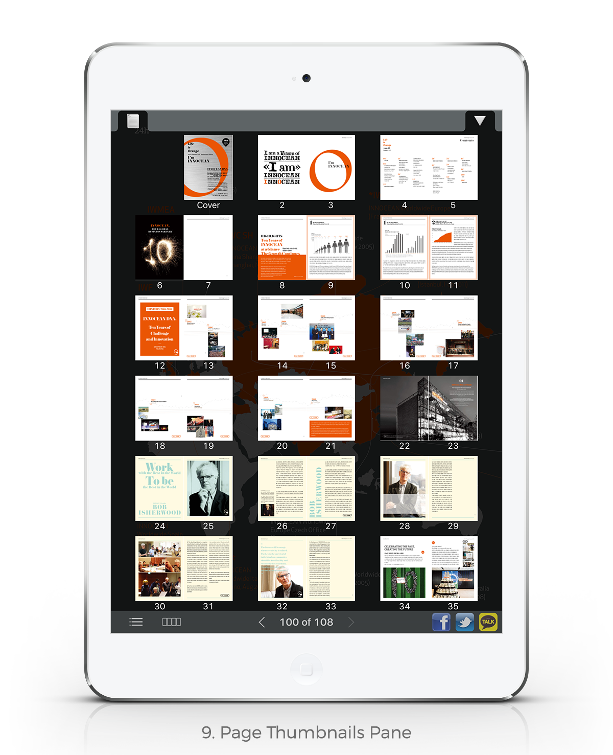
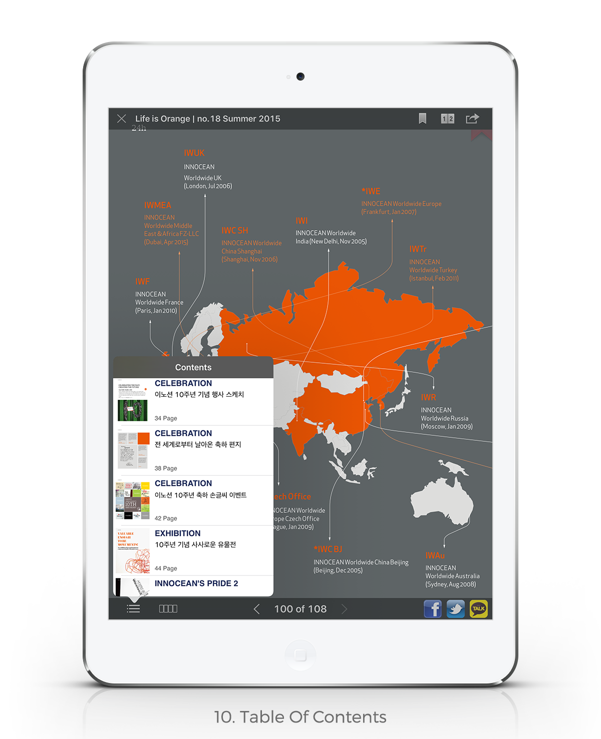
Examples of features I advocated for and implemented with our developers include bookmarking, sharing favorite articles and pictures through social media, creating a digital table of contents, and adding click-to-call functionality to advertisements.
WIREFRAMES
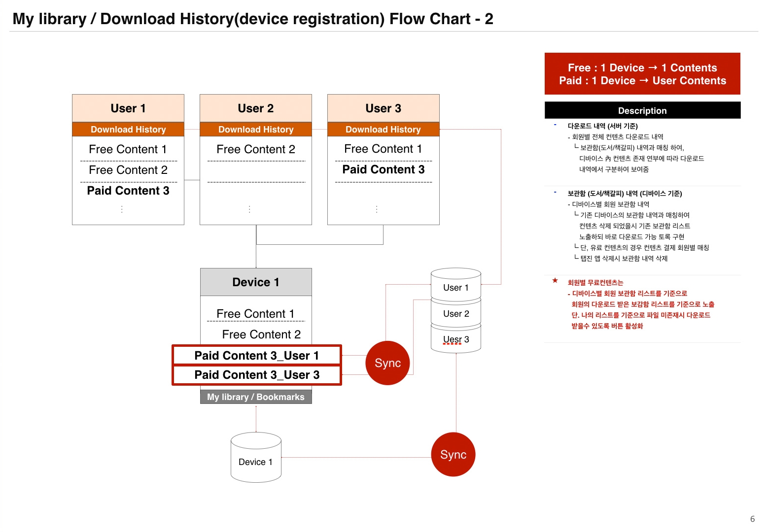
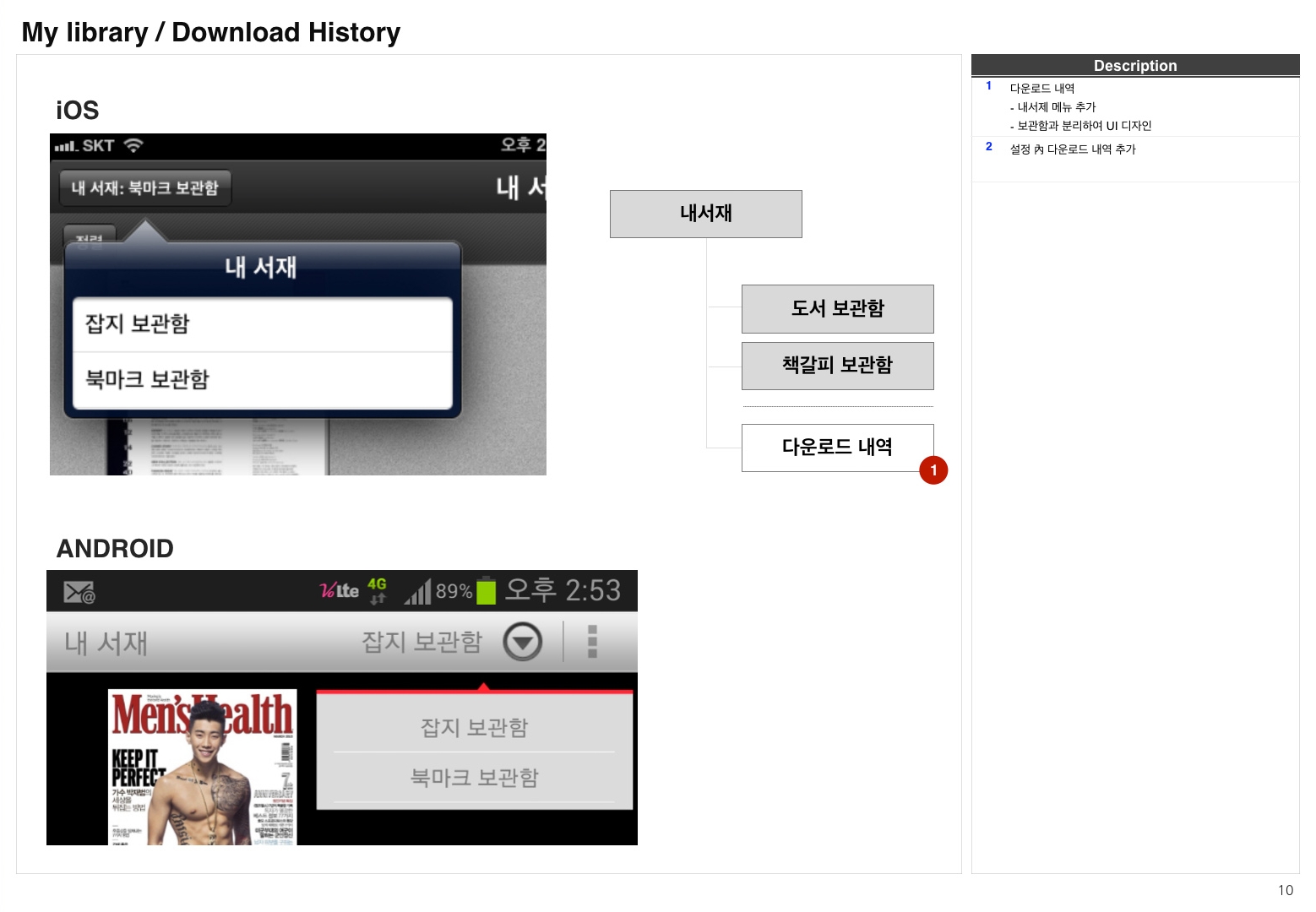
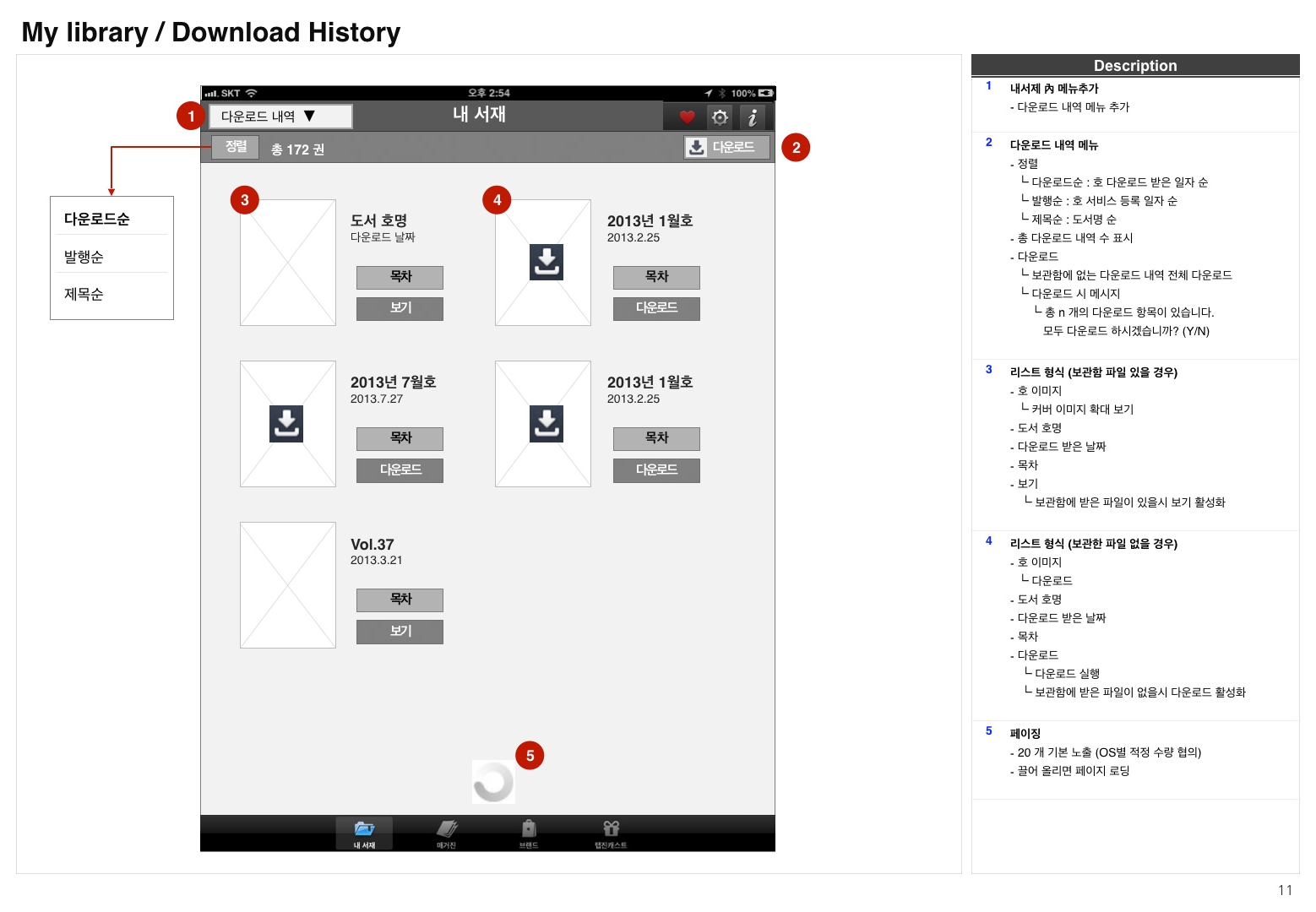
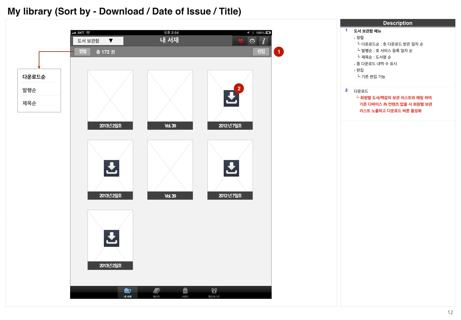
VISUAL DESIGN VARIATIONS TO EXPLORE LAYOUT
VERSION 1.5:
Monetization and In-App Advertising
As our service gained traction, we were able to receive lots of advertising requests. In order to not bother users as much as we can, I tried to place ad banners in a seamless way targeting the right users by placing ads in different categories depending on a brand and tried to adhere to consistent look and feel.
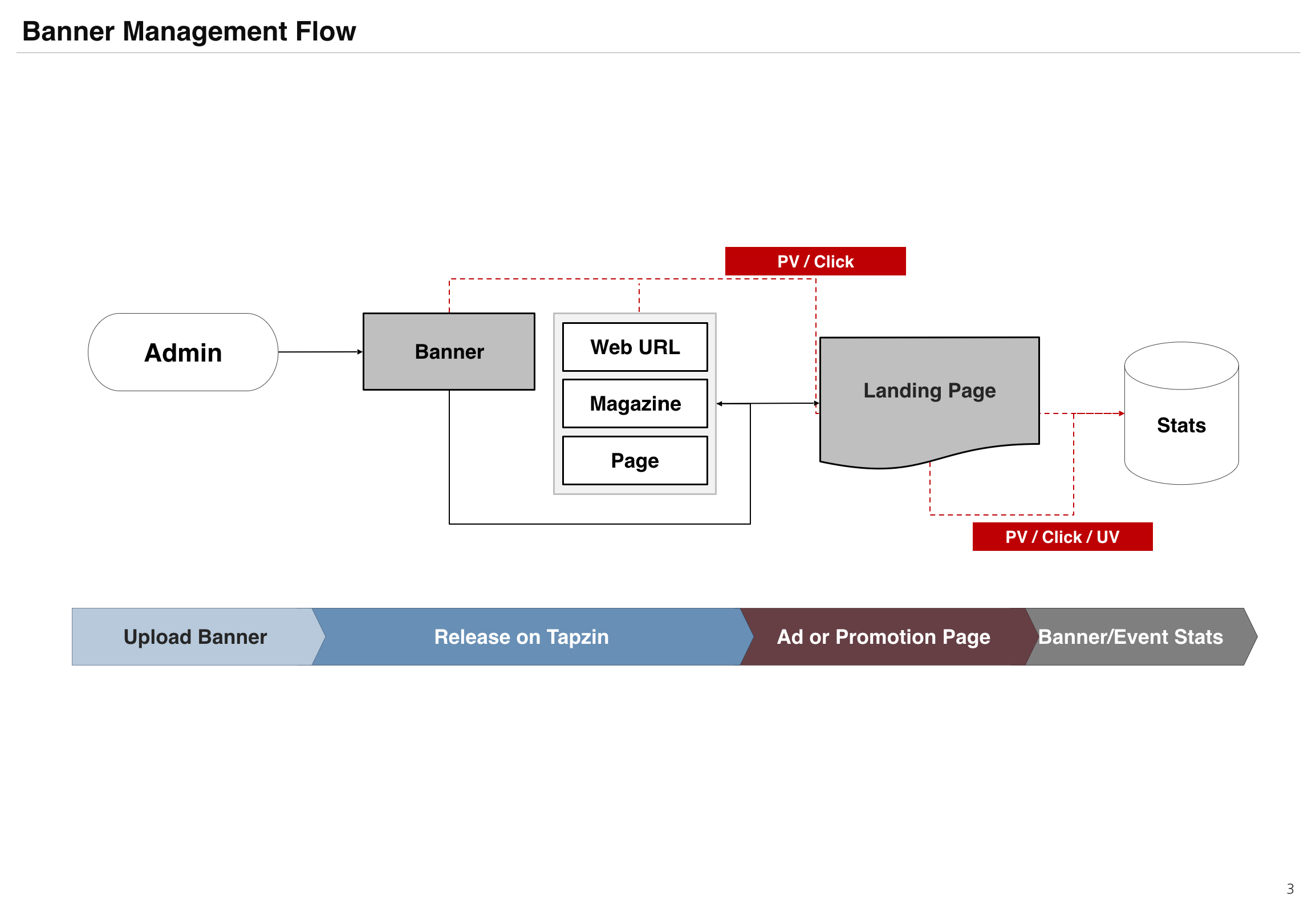
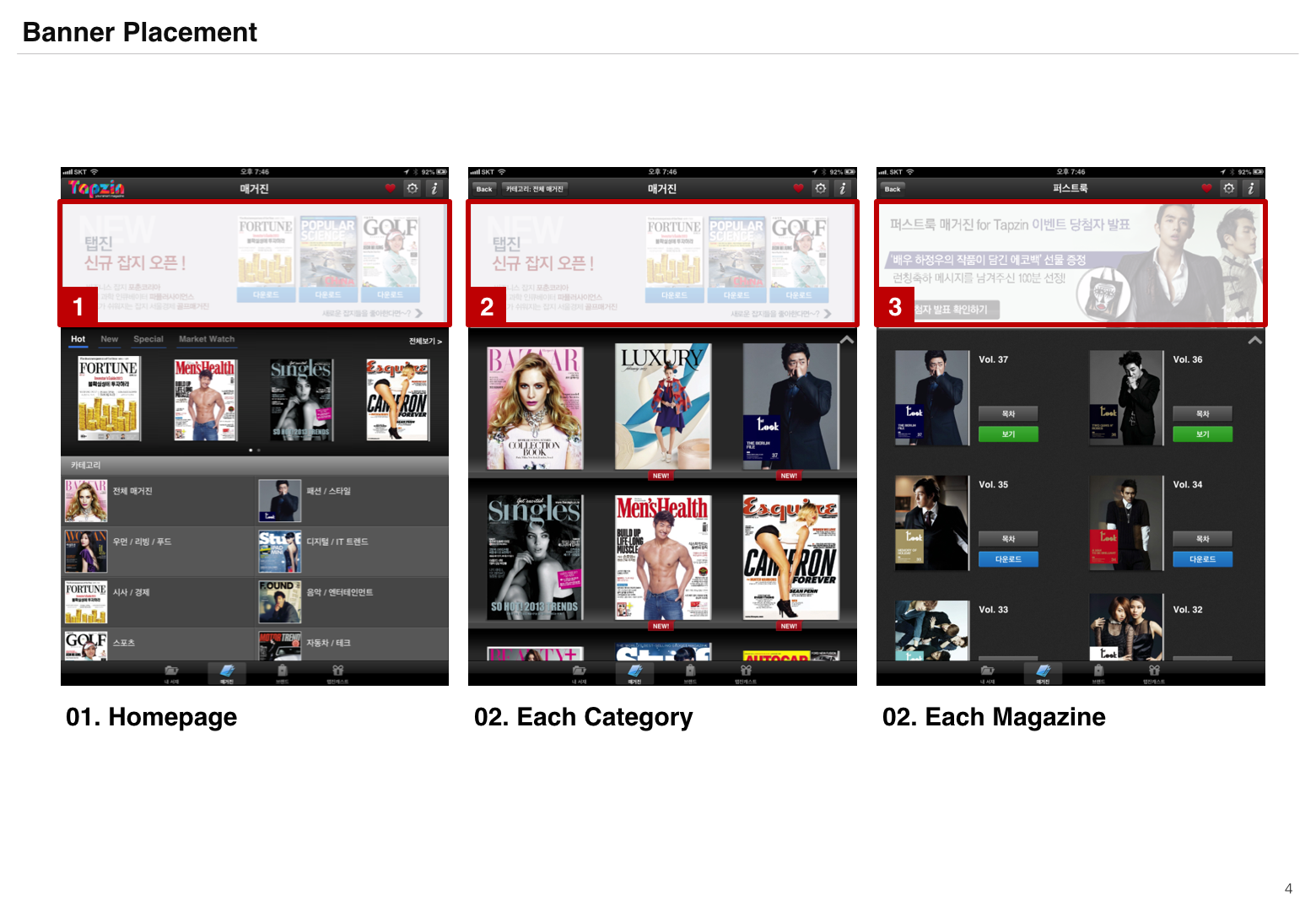
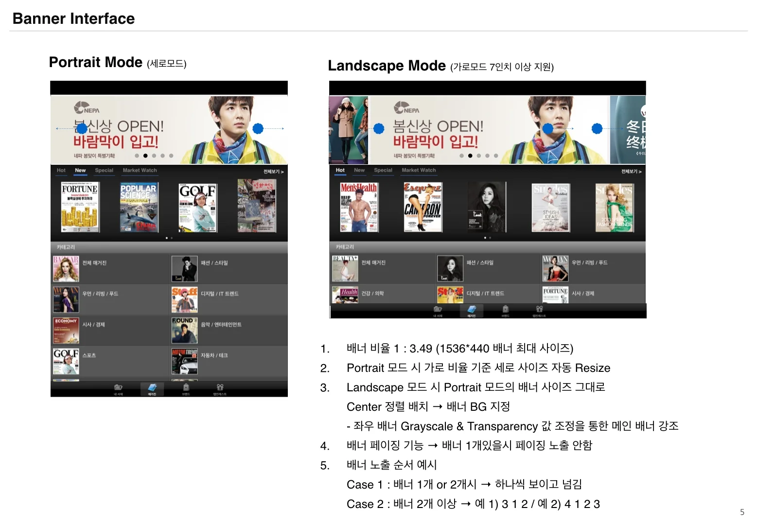
BANNER ADS
CREATING "MINI-MAGAZINES" FOR BRANDS
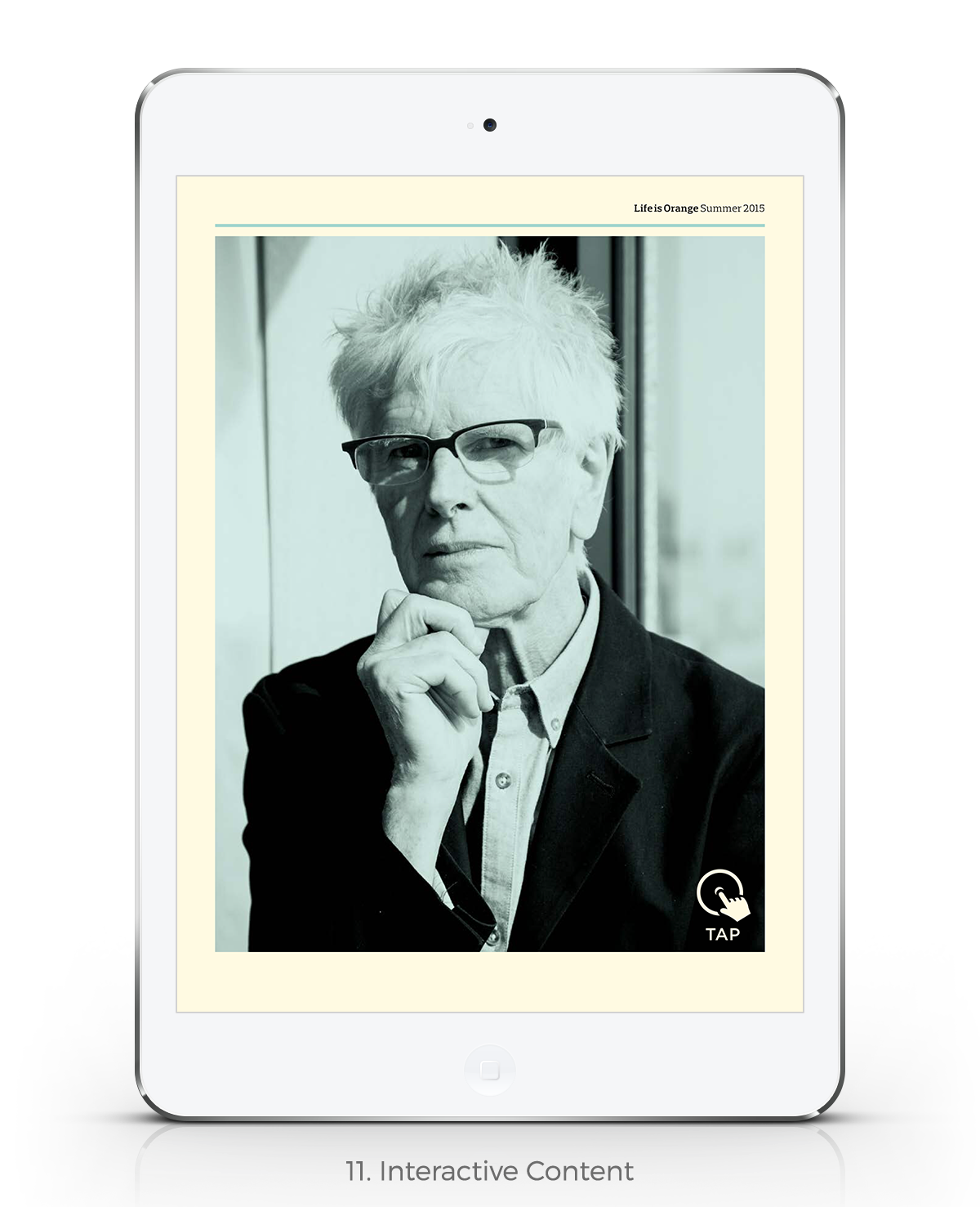
Although we display ads on a prominent location in the main page, I didn’t want to just link them to a fullscreen advertisement because our users want deep content. So instead, I worked with clients closely to create mini-magazines (somewhat like advertising ‘microsites’) that are focused on content around that advertiser. For example, I curated and redesigned the digital version of Ford Korea magazine and Lush cosmetics magazine with unique, interactive content, which you can see when you click the banner in Tapzin.
version 2.0:
improving usability and extending our product value
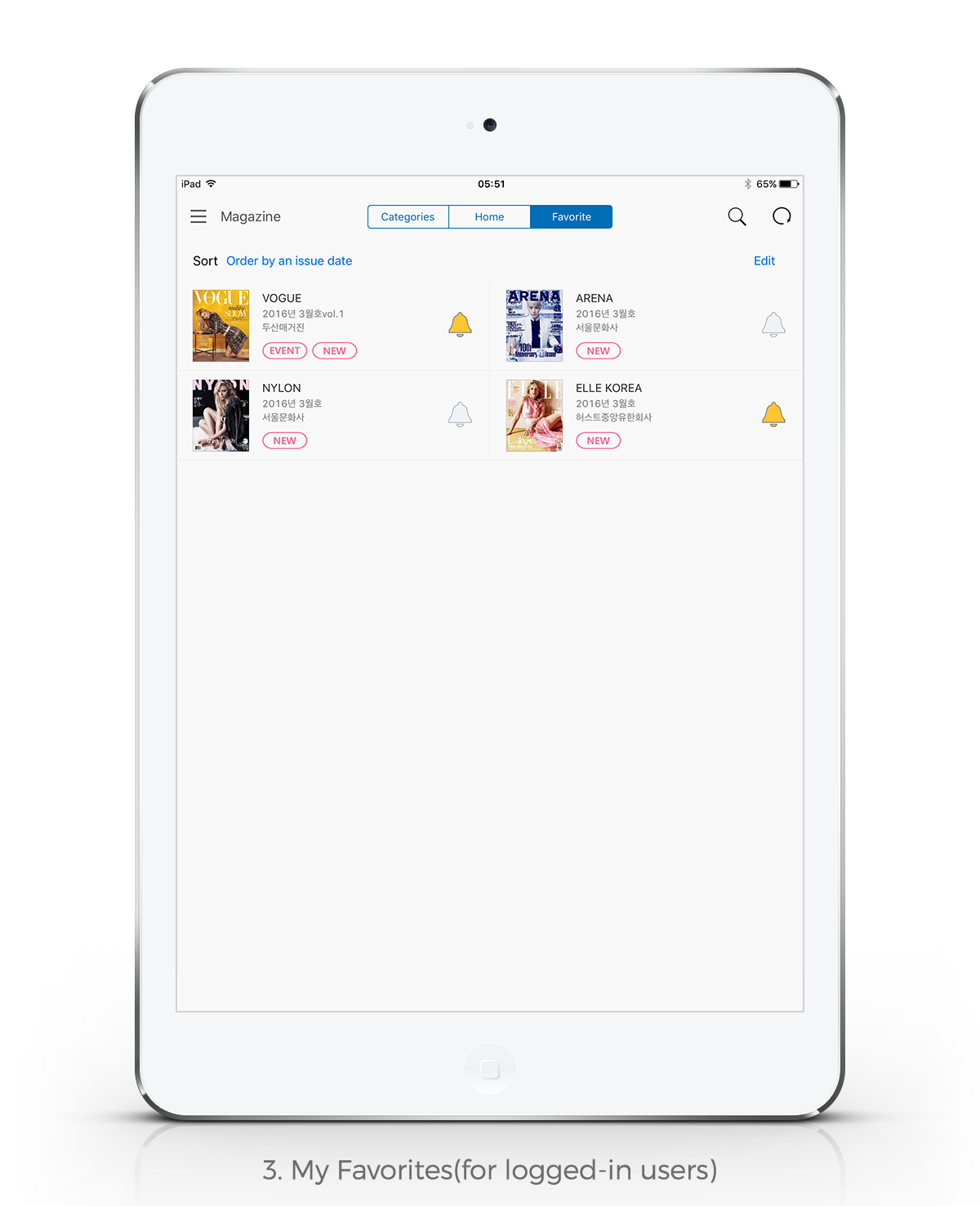
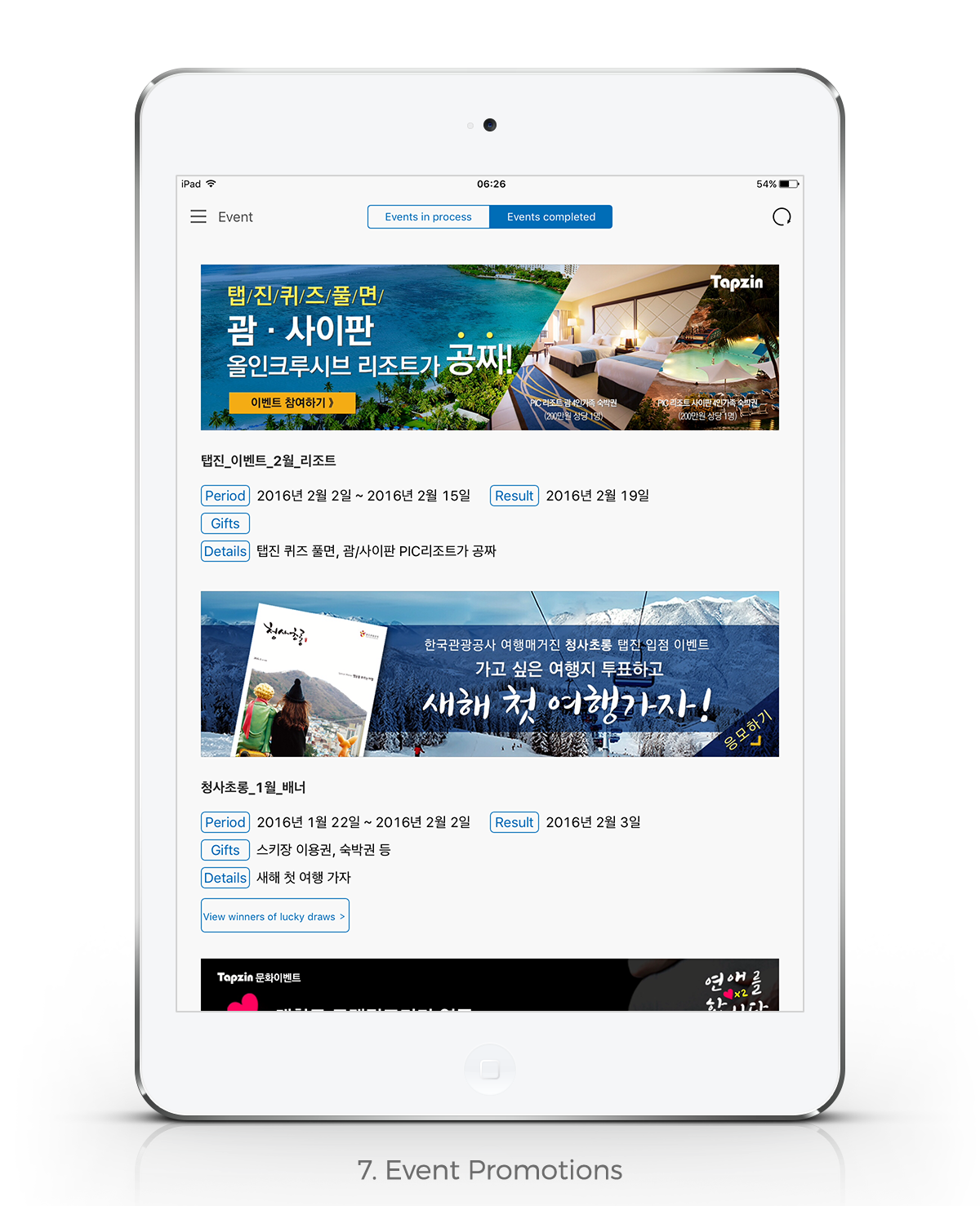
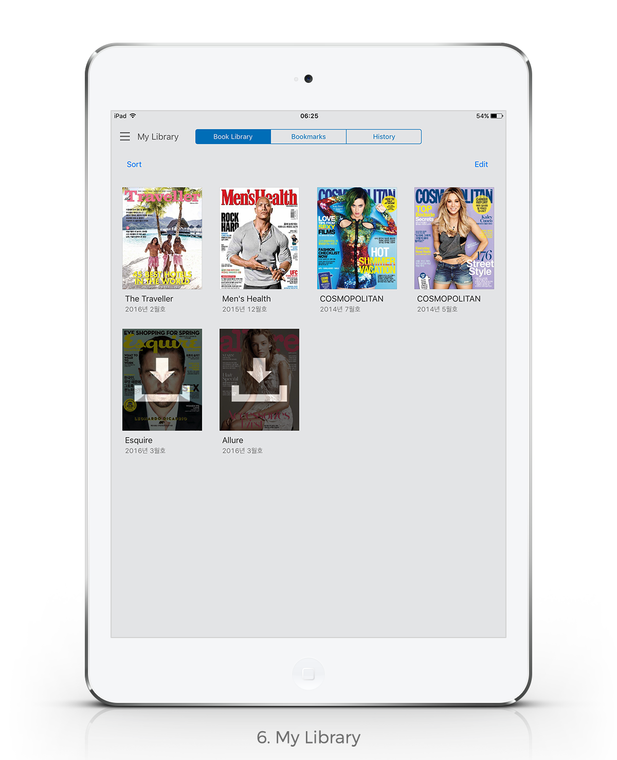
As our product continued to evolve, we found our product features to be outdated. I led the key product enhancements including feature updates to increasing the number of magazine downloads, inducing more users to sign up, and improving ad viewability.
KEY FEATURES
FEATURES TO INCREASE THE NUMBER OF
MAGAZINE DOWNLOADS
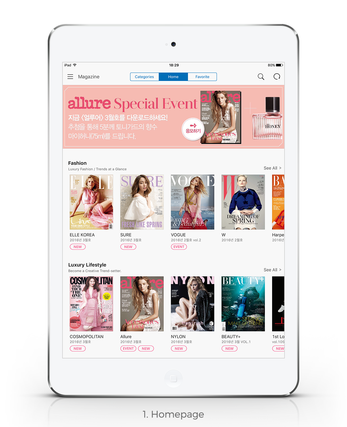
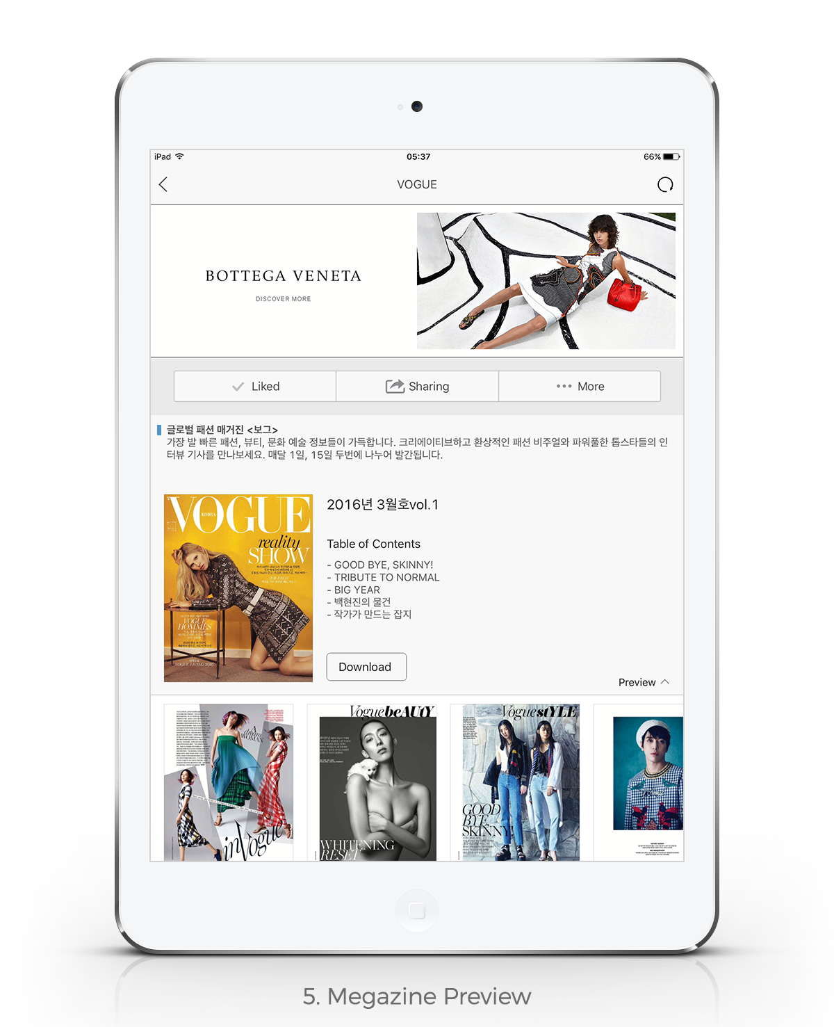
It was challenging for indie or less known magazines to get traction as the number of magazines increased. So I designed the main page that provides special thumbnails which show a title with brief content description so that users can get some sense of a magazine and draw their attention and added a preview section in each magazine's landing page that provides a preview of 5 pages every issues that people might enjoy and be curious about. The number of magazine downloads increased almost 11% after the update.
FEATURES TO IMPROVE AD IMPRESSIONS
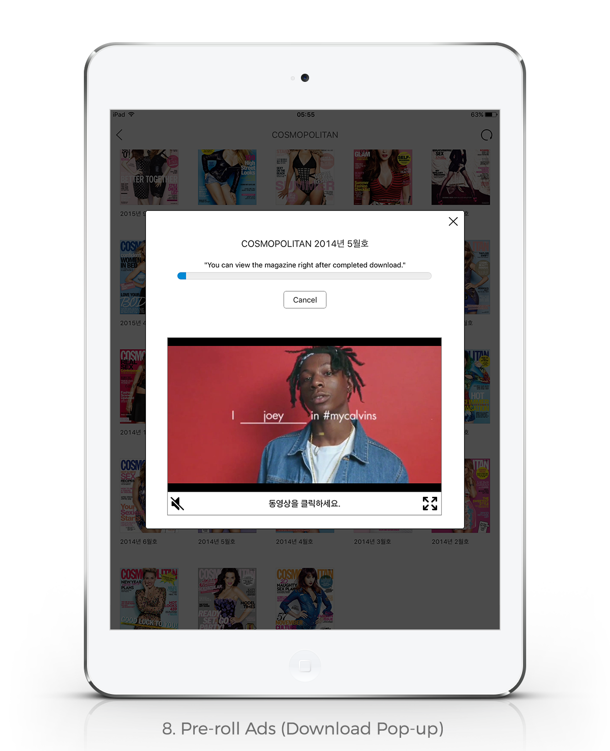
We placed a banner on each magazine separately so that we can target the right customers for ads. For example, we were able to place Bottega Veneta Ad for women on Vogue, Allure, Elle channels while placing Rolex ad on Esquire channel. Also, playing a pre-roll ad while users download a magazine was an efficient way to engage users with ads. These changes drove a 16% average increase in conversion rate.
PERFORMANCE
RANKED NO.1 IN BOTH APP STORE AND GOOGLE PLAY
Tapzin had been ranked no.1 in iOS App Store book category and Google Play News & Magazines category and is still always in the top 3 in Korea after multiple competitors showed up including Flipboard from the US.
3RD FIPP ASIA-PACIFIC DIGITAL MAGAZINE MEDIA CONFERENCE
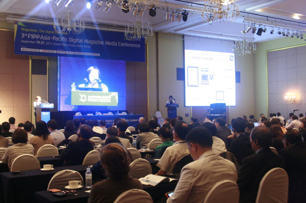
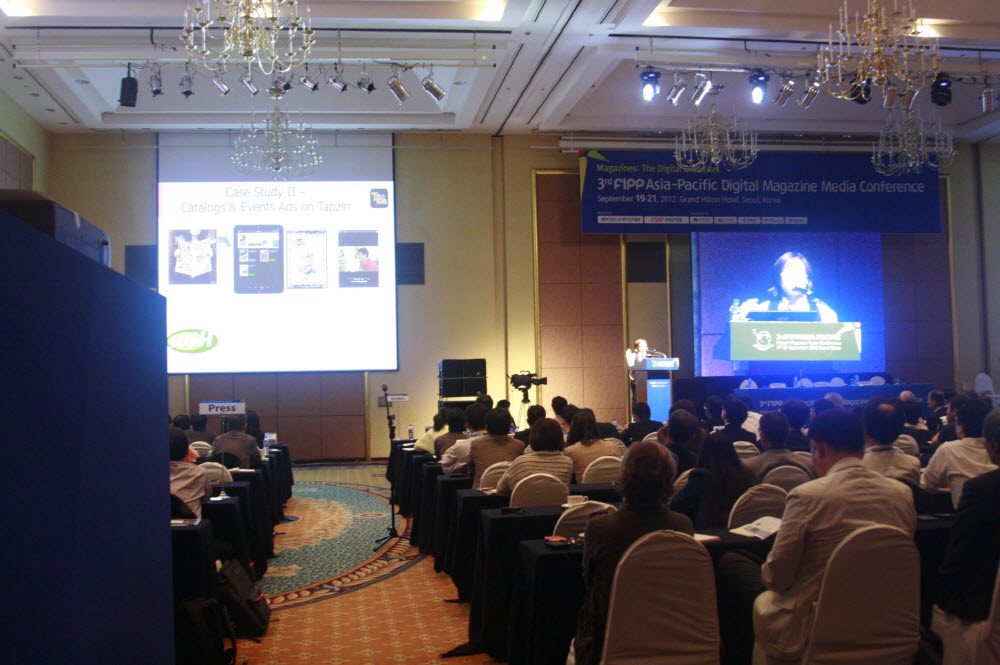
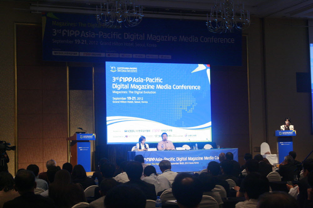
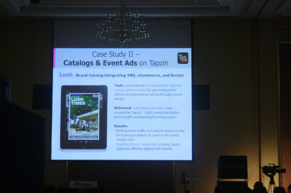
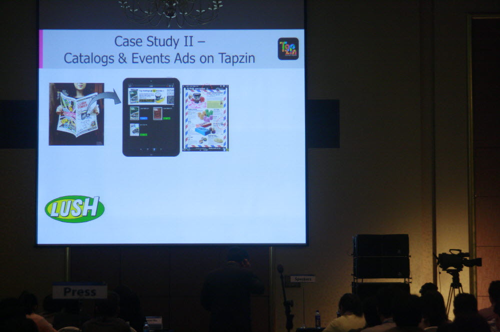
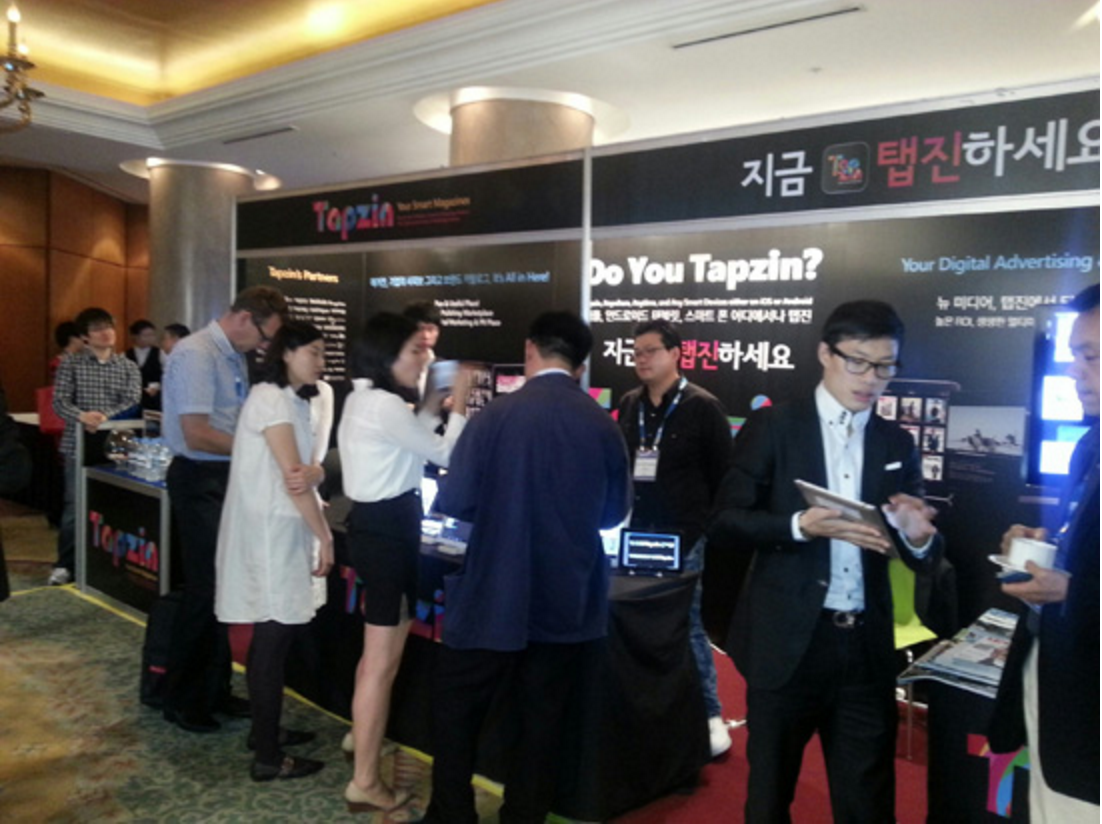
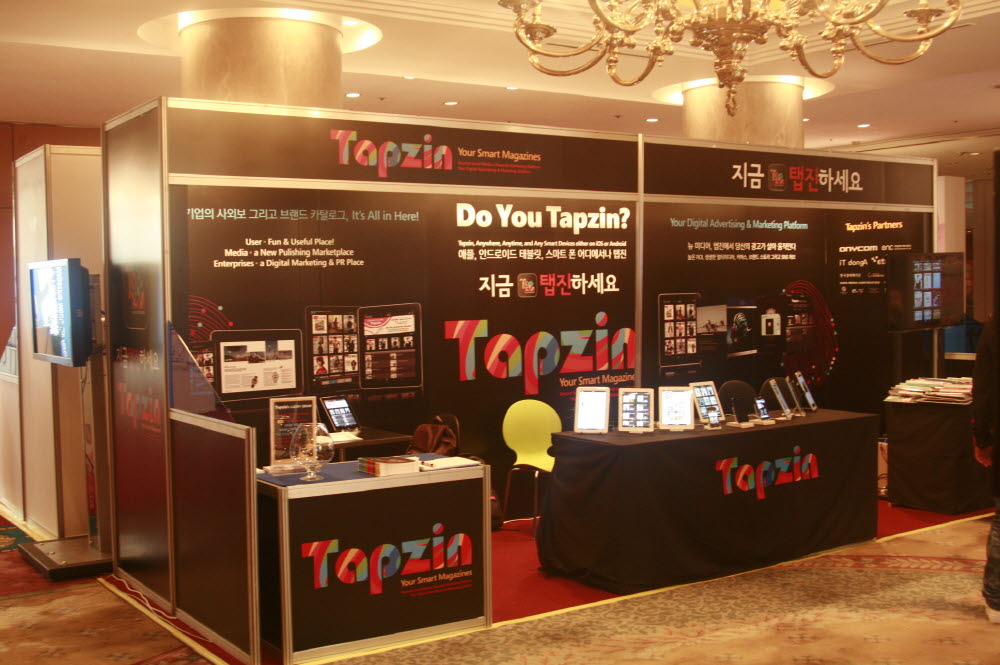
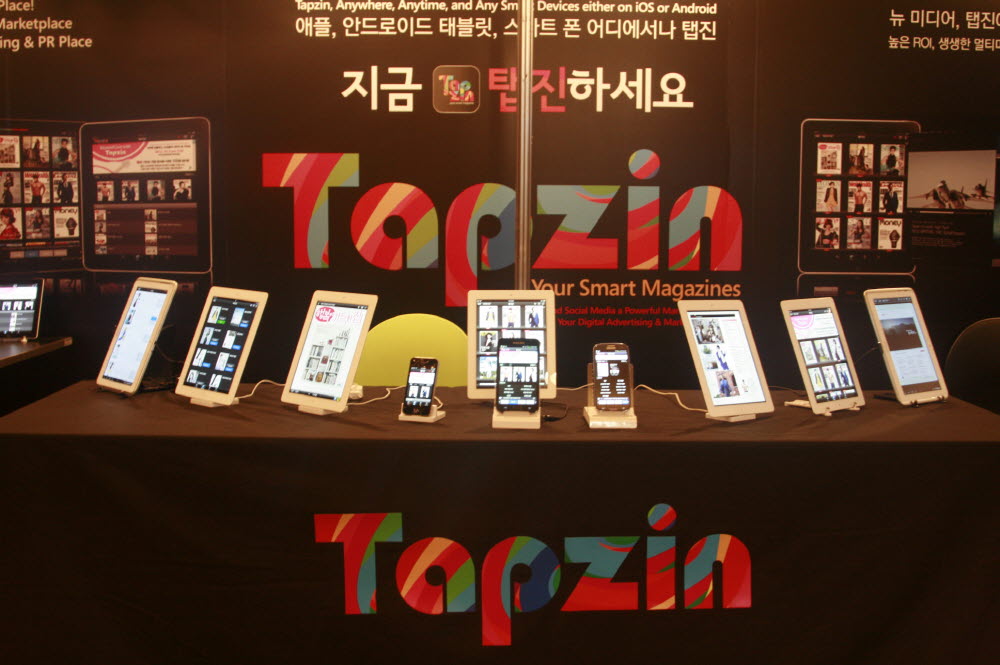
Selected as one of the conference keynote speakers, I shared our case studies as the leading product in the digital content market in Korea.
THE IMPACT
It wasn't easy to convince publishers to provide magazines for free to start, and to share the advertising revenue when users grow. However, once our service gained traction, the executives of traditional media publishers started thinking about our service differently, especially the ones who are the most conservative and famous, some of which we have been persuading for almost two years. We contracted more than 200 publishers that include multinationals such as Cosmopolitan Korea, Men's Health, Elle Korea, Esquire and etc.
EXPANSION OF BUSINESS
THROUGH USER FEEDBACK
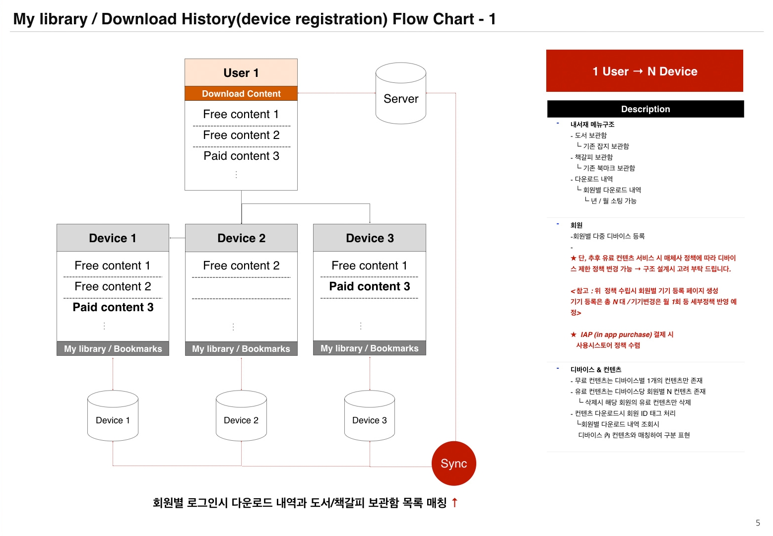
We had B2B product lines initially suggested from the active Tapzin users who later turned into clients. They wanted us to help them with their content for their businesses. I oversaw production for multiple white-labeled products such as standalone applications for specific magazines, digital brochures for sales teams, investor relations reports, and even a digital menu book for a fine dining restaurant. This unexpected expansion is especially meaningful because it proved our passion was delivered to users strongly enough that they came up with the new use.


